Transform retail operations with Zebra’s retail technology solutions, featuring hardware and software for improving inventory management and empowering teams.
Streamline operations with Zebra’s healthcare technology solutions, featuring hardware and software to improve staff collaboration and optimise workflows.
Enhance processes with Zebra’s manufacturing technology solutions, featuring hardware and software for automation, data analysis, and factory connectivity.
Zebra’s transportation and logistics technology solutions feature hardware and software for enhancing route planning, visibility, and automating processes.
Zebra's public sector technology solutions enhance decision-making, streamline operations, and safeguard communities with advanced software and rugged hardware.
Zebra's hospitality technology solutions equip your hotel and restaurant staff to deliver superior customer and guest service through inventory tracking and more.
Zebra's market-leading solutions and products improve customer satisfaction with a lower cost per interaction by keeping service representatives connected with colleagues, customers, management and the tools they use to satisfy customers across the supply chain.
Empower your field workers with purpose-driven mobile technology solutions to help them capture and share critical data in any environment.
Zebra's range of mobile computers equip your workforce with the devices they need from handhelds and tablets to wearables and vehicle-mounted computers.
Zebra's desktop, mobile, industrial, and portable printers for barcode labels, receipts, RFID tags and cards give you smarter ways to track and manage assets.
Zebra's 1D and 2D corded and cordless barcode scanners anticipate any scanning challenge in a variety of environments, whether retail, healthcare, T&L or manufacturing.
Zebra's extensive range of RAIN RFID readers, antennas, and printers give you consistent and accurate tracking.
Choose Zebra's reliable barcode, RFID and card supplies carefully selected to ensure high performance, print quality, durability and readability.
Zebra's rugged tablets and 2-in-1 laptops are thin and lightweight, yet rugged to work wherever you do on familiar and easy-to-use Windows or Android OS.
With Zebra's family of fixed industrial scanners and machine vision technologies, you can tailor your solutions to your environment and applications.
Zebra’s line of kiosks can meet any self-service or digital signage need, from checking prices and stock on an in-aisle store kiosk to fully-featured kiosks that can be deployed on the wall, counter, desktop or floor in a retail store, hotel, airport check-in gate, physician’s office, local government office and more.
Discover Zebra’s range of accessories from chargers, communication cables to cases to help you customise your mobile device for optimal efficiency.
Zebra's environmental sensors monitor temperature-sensitive products, offering data insights on environmental conditions across industry applications.
Zebra's location technologies provide real-time tracking for your organisation to better manage and optimise your critical assets and create more efficient workflows.
Enhance frontline operations with Zebra’s AI software solutions, which optimize workflows, streamline processes, and simplify tasks for improved business outcomes.
Empower your frontline with Zebra Companion AI, offering instant, tailored insights and support to streamline operations and enhance productivity.
Boost productivity with Zebra Frontline AI Enablers: AI vision models, sample apps, and APIs streamline workflows for efficient business processes.
Zebra Frontline AI Blueprints deliver adaptable, real-world AI frameworks that automate manual tasks and drive efficiency in high-pressure frontline operations.
Zebra Workcloud, enterprise software solutions boost efficiency, cut costs, improve inventory management, simplify communication and optimize resources.
Keep labour costs low, your talent happy and your organisation compliant. Create an agile operation that can navigate unexpected schedule changes and customer demand to drive sales, satisfy customers and improve your bottom line.
Drive successful enterprise collaboration with prioritized task notifications and improved communication capabilities for easier team collaboration.
Get full visibility of your inventory and automatically pinpoint leaks across all channels.
Reduce uncertainty when you anticipate market volatility. Predict, plan and stay agile to align inventory with shifting demand.
Drive down costs while driving up employee, security, and network performance with software designed to enhance Zebra's wireless infrastructure and mobile solutions.
Explore Zebra’s printer software to integrate, manage and monitor printers easily, maximising IT resources and minimising down time.
Make the most of every stage of your scanning journey from deployment to optimisation. Zebra's barcode scanner software lets you keep devices current and adapt them to your business needs for a stronger ROI across the full lifecycle.
RFID development, demonstration and production software and utilities help you build and manage your RFID deployments more efficiently.
RFID development, demonstration and production software and utilities help you build and manage your RFID deployments more efficiently.
Zebra DNA is the industry’s broadest suite of enterprise software that delivers an ideal experience for all during the entire lifetime of every Zebra device.
Advance your digital transformation and execute your strategic plans with the help of the right location and tracking technology.
The Zebra Aurora suite of machine vision software enables users to solve their track-and-trace, vision inspection and industrial automation needs.
Zebra Aurora Focus brings a new level of simplicity to controlling enterprise-wide manufacturing and logistics automation solutions. With this powerful interface, it’s easy to set up, deploy and run Zebra’s Fixed Industrial Scanners and Machine Vision Smart Cameras, eliminating the need for different tools and reducing training and deployment time.
Aurora Imaging Library™, formerly Matrox Imaging Library, machine-vision software development kit (SDK) has a deep collection of tools for image capture, processing, analysis, annotation, display, and archiving. Code-level customisation starts here.
Aurora Design Assistant™, formerly Matrox Design Assistant, integrated development environment (IDE) is a flowchart-based platform for building machine vision applications, with templates to speed up development and bring solutions online quicker.
Designed for experienced programmers proficient in vision applications, Aurora Vision Library provides the same sophisticated functionality as our Aurora Vision Studio software but presented in programming language.
Aurora Vision Studio, an image processing software for machine & computer vision engineers, allows quick creation, integration & monitoring of powerful OEM vision applications.
Adding innovative tech is critical to your success, but it can be complex and disruptive. Professional Services help you accelerate adoption, and maximise productivity without affecting your workflows, business processes and finances.
Zebra's Managed Service delivers worry-free device management to ensure ultimate uptime for your Zebra Mobile Computers and Printers via dedicated experts.
Find ways you can contact Zebra Technologies’ Support, including Email and Chat, ask a technical question or initiate a Repair Request.
Zebra's Circular Economy Program helps you manage today’s challenges and plan for tomorrow with smart solutions that are good for your budget and the environment.
Zebra's Blog and Podcast
Zebra Technologies brings you expert advice and innovative stories about how we create new ways of working that improve productivity and empower organizations to be better every day.

Most Recent
Browse All Blog Posts and Podcast Episodes
![[Category, Subcat or Product] Representational Image 16:9](/content/dam/zebra_dam/global/zcom-web-production/web-production-photography/newsroom/2026-images/photography-web-newsroom-featured-03-16x9-en-us-022726.jpg.imgo.jpg)
The High Cost of a Single Glance: Rethinking Frontline Safety
More
![[Category, Subcat or Product] Representational Image 16:9](/content/dam/zebra_dam/global/zcom-web-production/web-production-photography/newsroom/2026-images/photography-web-newsroom-featured-hero-16x9-en-042426.jpg.imgo.jpg)
Winning Together: From Transaction to Partnership on the Frontline
More

How to Secure Retail Devices Without Compromising Customer Experience
More

Winning Together: How Total Asset Visibility Unlocks Your Competitive Edge
More

A Sweet Escape: What a Chocolate Heist Teaches Us About Supply Chain Resiliency
More

The Intelligent Factory: Turning AI-Powered Vision into Frontline Value
More

Winning Together: Orchestrating the Frontline: Why Connected Teams Succeed
More
The Automated Warehouse: A Pragmatic Blueprint for the Future of Logistics
More
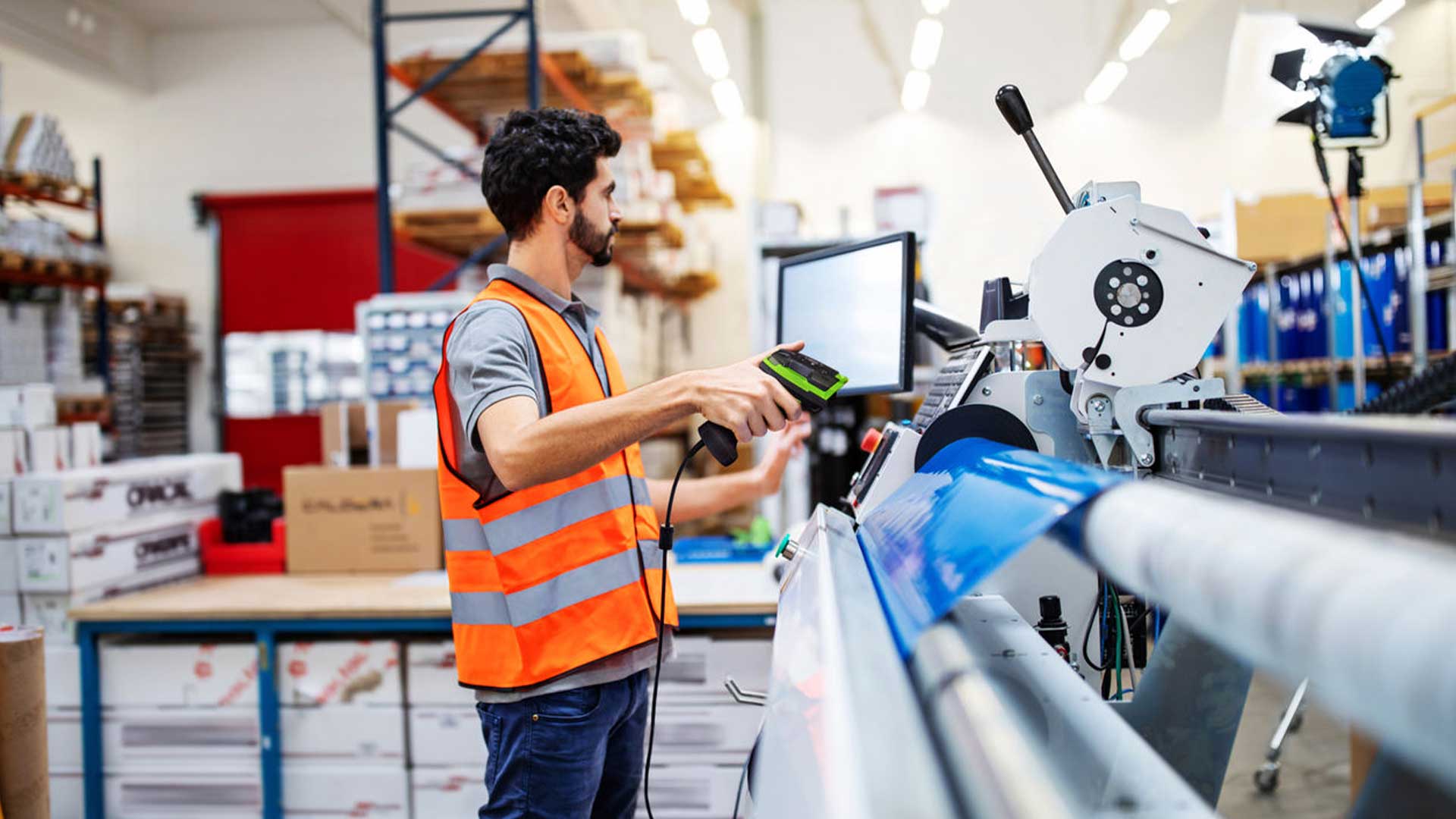
Winning Together: Forging a Truly Connected Frontline
More

Forging the Critical Link: How Perception-Driven Automation Solves Warehouse Chaos
More

Winning Together: Our Commitment to Partner Success
More

How to Improve Last-Mile Efficiency with AI-Enabled Devices
More

Winning Together: How Software and AI Unify and Guide Your Frontline Workforce
More

AI Performs the Impossibly Complex Analyses; Humans Provide the Final Strategic Touch
More

From Hurried to Helped: A New Era in Clinical Collaboration
More

The Final 50 Feet: Closing the Trust Gap with AI-Powered Deliveries
More

Ready from Day One: The Secret to a High-Performing Frontline
More

Beyond the Hype: How Retail Leaders Put AI to Work on the Frontline
More

Unburdening Clinicians and Harmonizing Care Delivery: A Q&A on Zebra's Orchestrated Care
More

Winning Together: How Partnership Fuels Our Shared Success
More
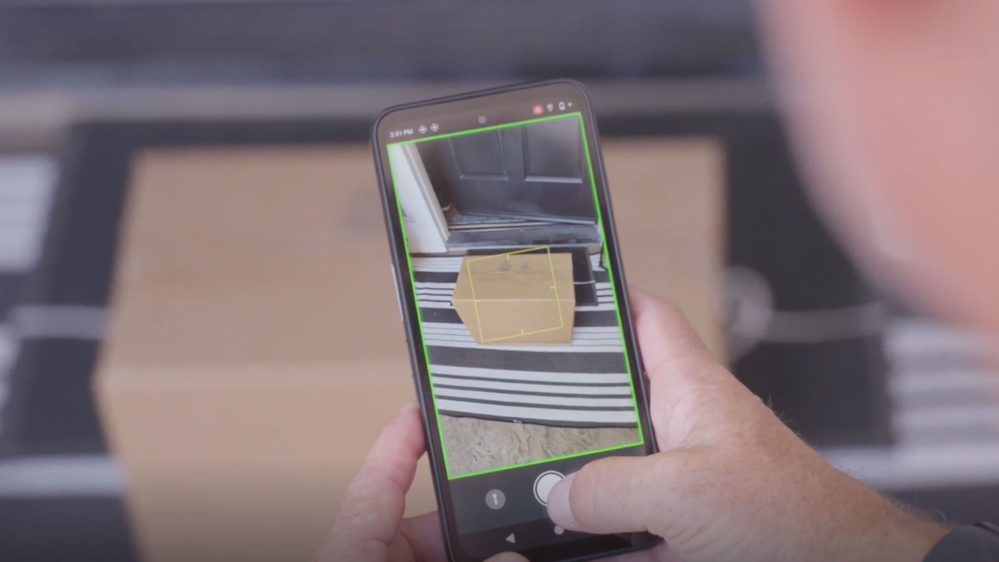
The Blueprint for Frontline AI: A Conversation on Driving Real-World Results
More

Better Every Day: How We Can Empower Healthcare’s Frontline Workers
More

Manufacturing 2026: The New Playbook for Intelligent Operations
More

Tackling Frontline Challenges with a Unified Collaboration Platform
More
![[Category, Subcat or Product] Representational Image 16:9](/content/dam/zebra_dam/global/zcom-web-production/web-production-photography/newsroom/2026-images/photography-web-newsroom-featured-03-16x9-en-us-013026.jpg.imgo.jpg)
Navigating the Next Wave: How Intelligent Operations Will Define T&L in 2026
More

How FedEx is Solving for Billions of Blind Spots in the Supply Chain
More

From Sci-Fi to the Sales Floor: Four Practical Takeaways from NRF 2026
More

From Hours to Minutes: Solving Retail IT Issues Faster, Together
More

What Our Ride at NRF Says About the Future of Retail
More

Putting Automation to Work: From Tedious Tasks to Tangible Triumphs
More

Collaborating for Accessibility: Enabling Technology Together
More

Beyond the Drop Test: Why True Ruggedness is Your Smartest Investment
More

Beyond the Hype: How AI on the Frontline Forges the Future of Retail
More
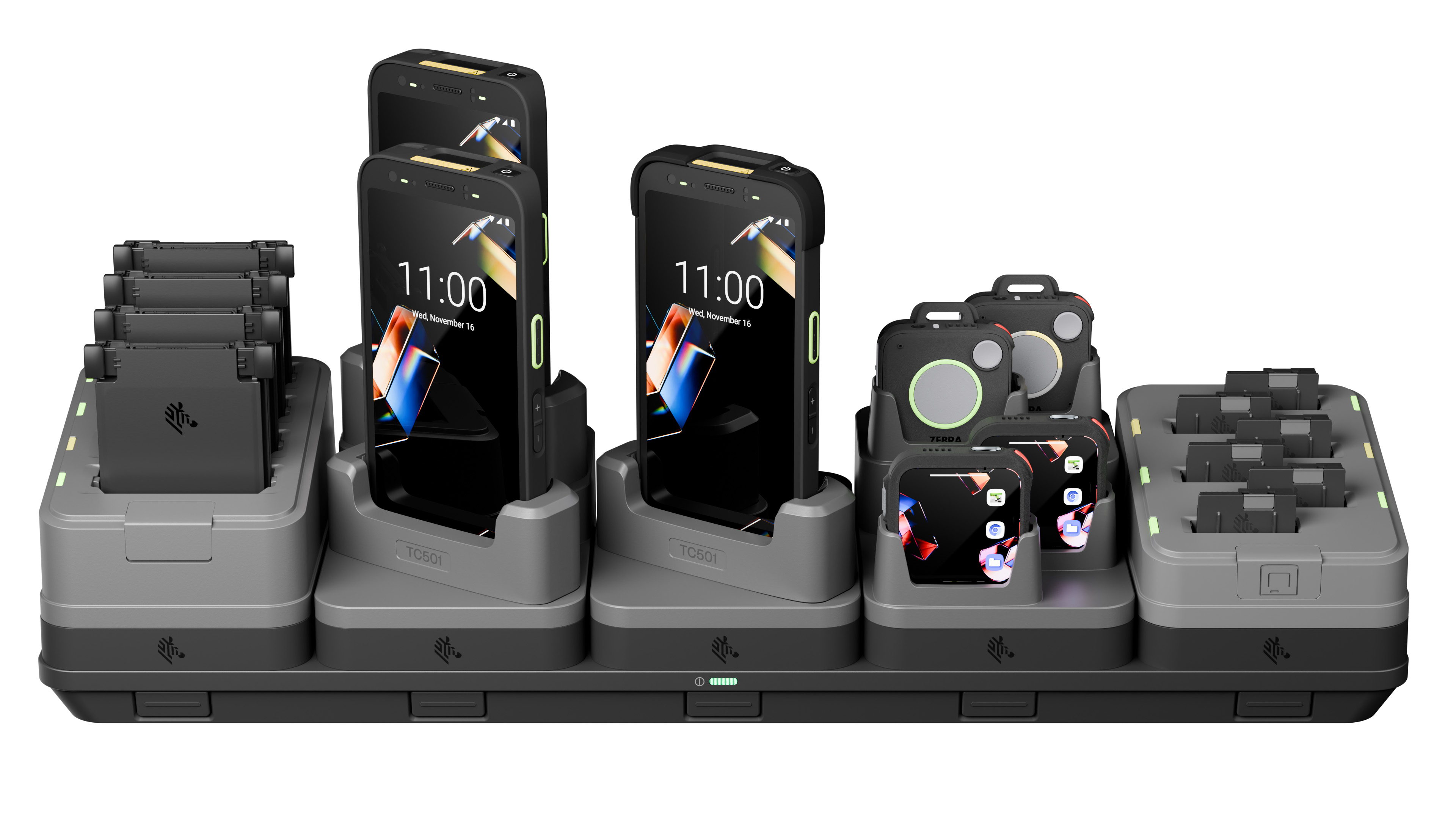
Declutter Your Backroom, Supercharge Your Frontline
More

CES 2026: The AI Revolution You Won’t See on the Show Floor
More

Charting Our Course, Together: Celebrating a Year of Shared Success
More

Stronger Together: How Zebra’s Channel Leaders See a Collaborative Future
More

Chalk Talk with Brandon Copeland on Giving Back and Gridiron Grit
More

It’s Time to Rethink Pricing Metrics for Retail Success
More

Intelligent Workforce Optimization: How Office Depot Drives Efficiency with Zebra Workcloud
More

Making Frontline Work Smarter with the ET401 Tablet
More

Your Frontline, Your Future: Insights from Zebra’s Frontline AI Summit
More
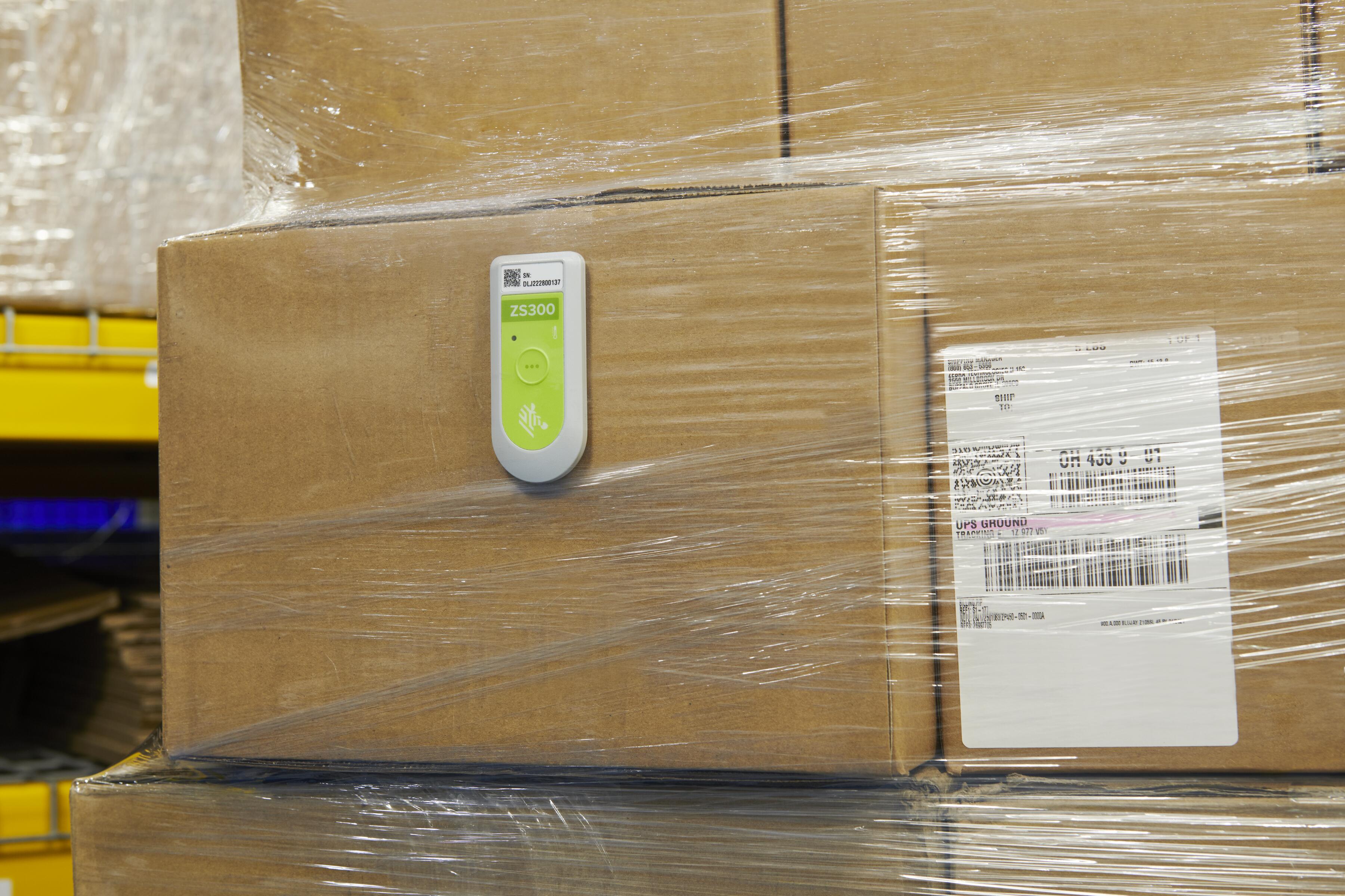
Think Inside the Box: Item-level Monitoring Inside Your Reefer Containers
More

Refreshing Perspective: Why Your Brand Needs to Evolve with Your Business
More

How AI-Powered Analytics and Technology Help Uncover Hidden Retail Losses
More

Connected Frontline Technology Unlocks Team Potential
More

Former Store Manager’s Perspective on Overcoming Retail Challenges with Technology
More

How Will AI and Technology Elevate Shopping and Empower Frontline Teams?
More

Remembering Ed Barkan: A Visionary, Innovator, and Friend
More

Solving Frontline Challenges: A Conversation You Don’t Want to Miss
More

How Leaders Can Build a Stronger Connection with Workers
More

The Invisible Network Behind Your Favorite Shoes
More

How Do You Track a Crutch When It Leaves the Hospital?
More

5 Technology Trends for Warehouse Mobile Devices in 2026
More
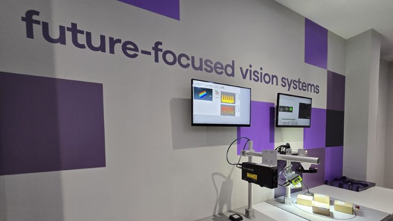
Collaboration Helps Close the Machine Vision Knowledge Gap
More

A Closer Look at How AI Changes the Way We Work
More

The Future of Community Nursing
More

Smarter Labeling: How Automation Software Transforms Print Efficiency & Quality
More

G10 Fulfillment Enables Growth, Cost Savings with Zebra Robotics
More

Workplace Safety in Healthcare: A Vital Priority
More
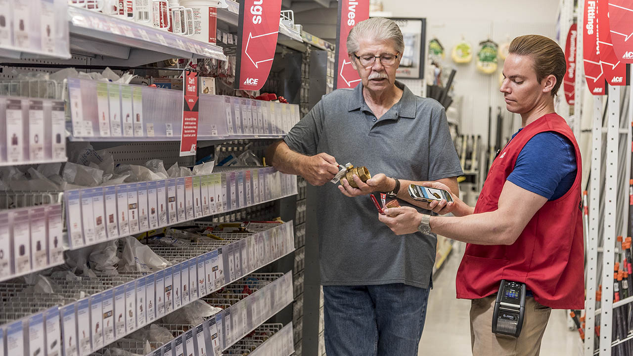
Intelligent Task Management and Demand Insights Transform Retail Operations
More

Intelligent Operations Empower Frontline Heroes
More

Adapt to Thrive: Unlocking Manufacturing Efficiency
More

Five Years of Partner Appreciation: Celebrating the People Behind Our Success
More

Real-Time Visibility and Workforce Connectivity Transform Logistics Operations
More

Intelligent Operations Help Retailers Be Better Every Day
More

Driving Intelligent Operations So Organizations Can Be Better Every Day
More

One Device, Infinite Frontlines
More

The Zebra Mobile Computing AI Suite Makes Frontline Work Better for Everyone
More
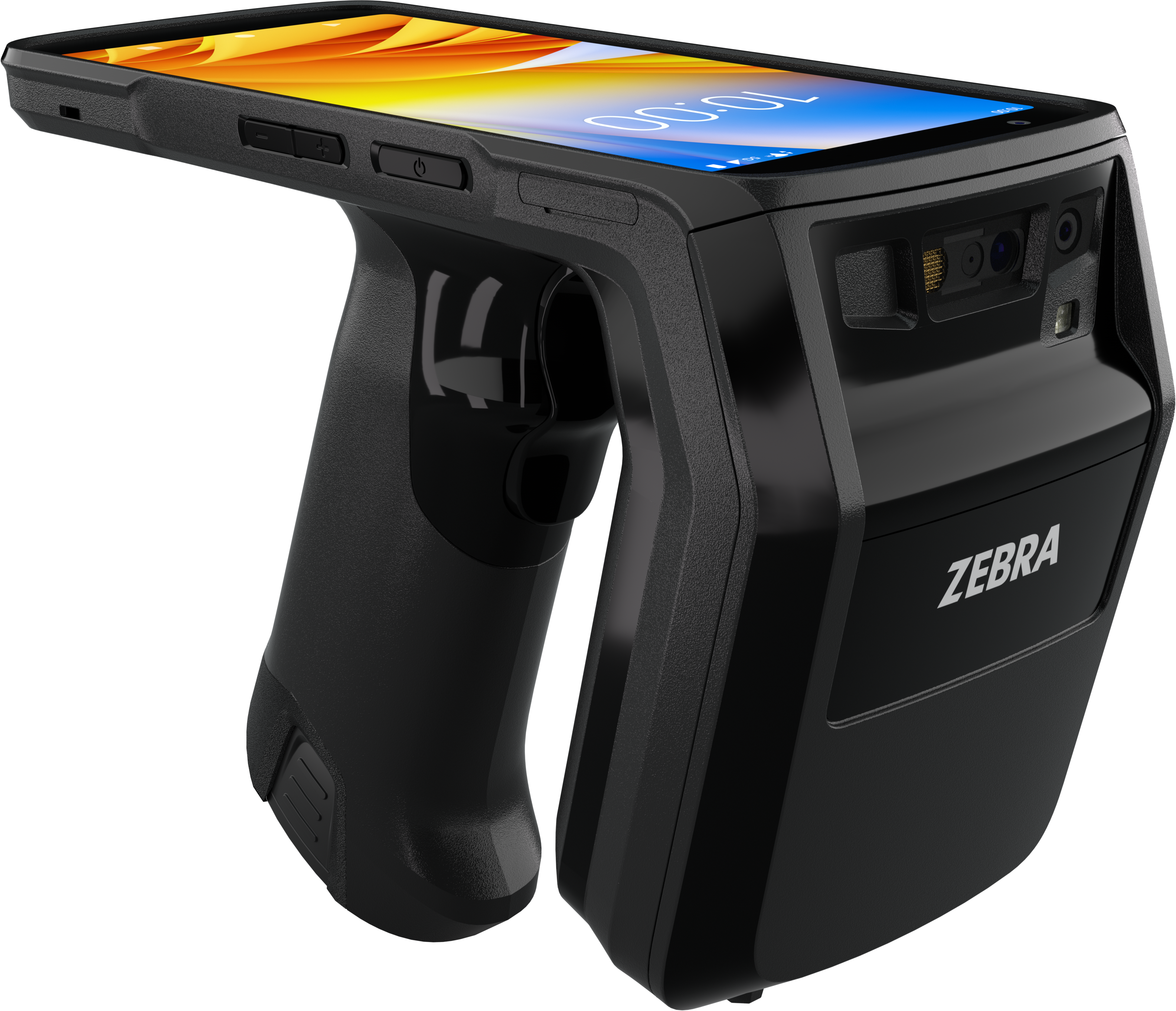
Track Assets Easily with a Lightweight, All-Touch Handheld RFID Reader
More
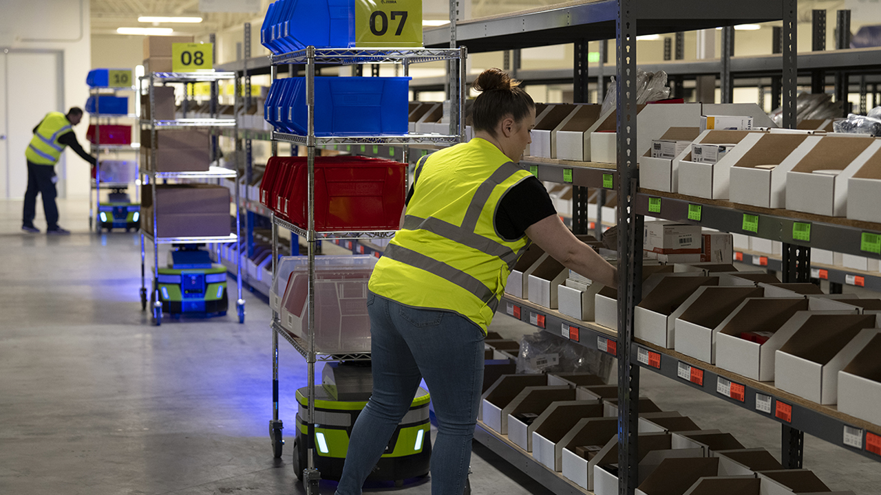
Zebra Technologies Recognized Again in the Gartner® Hype Cycle™ for Intralogistics Smart Robots and Drones
More

How Unified Communication and AI are Changing Retail
More

Zebra Workcloud Suite Empowers the Frontline and Solves Retail Challenges
More

Welcome to Conversations with a CNIO: Bridging Healthcare and Technology
More
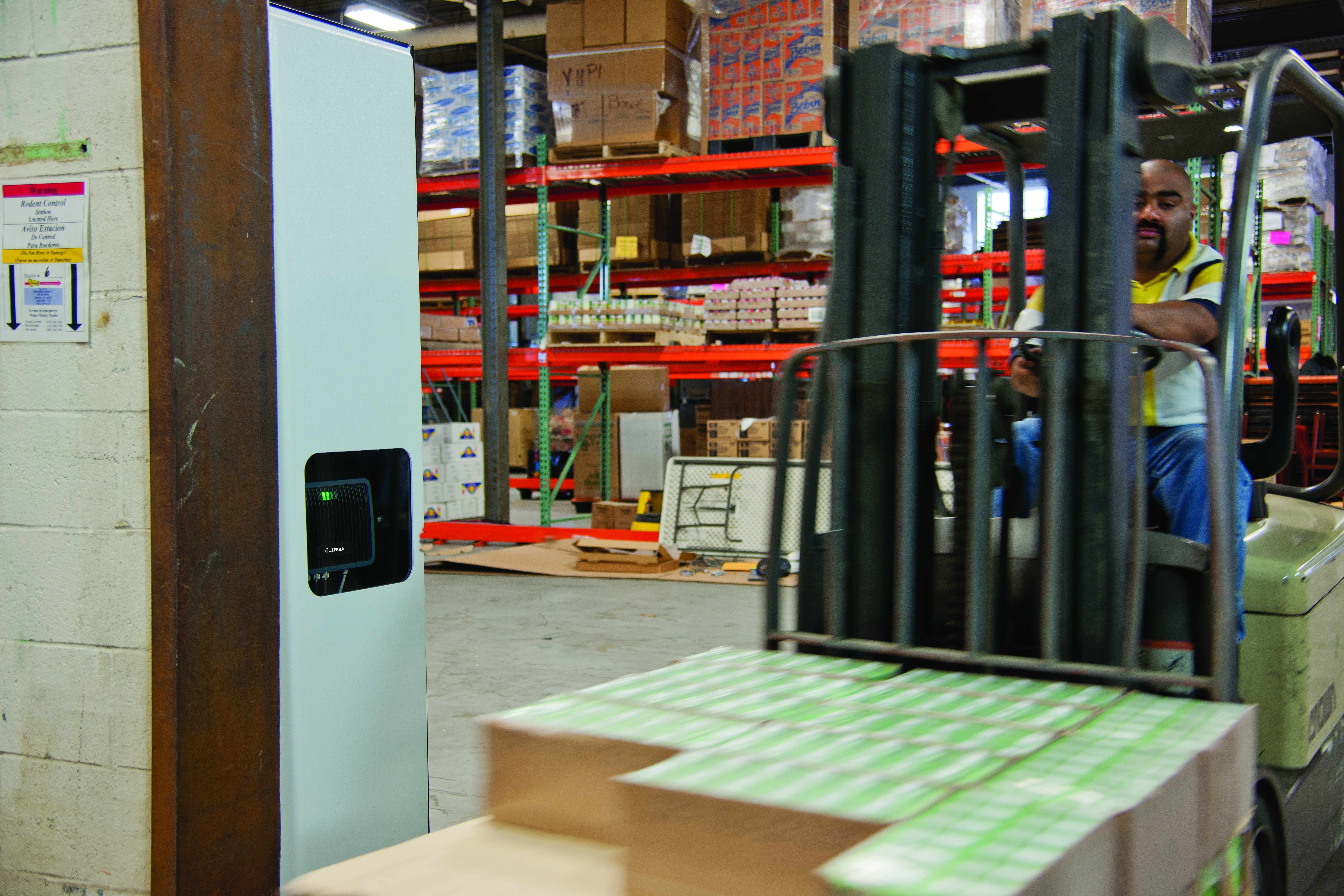
Unlocking the Power of Asset Visibility for Frontline Operations
More

Why Your Frontline Data Could Be the Key to Unlocking AI’s Full Potential
More

Explore the Future of AI at the Frontline AI Summit
More
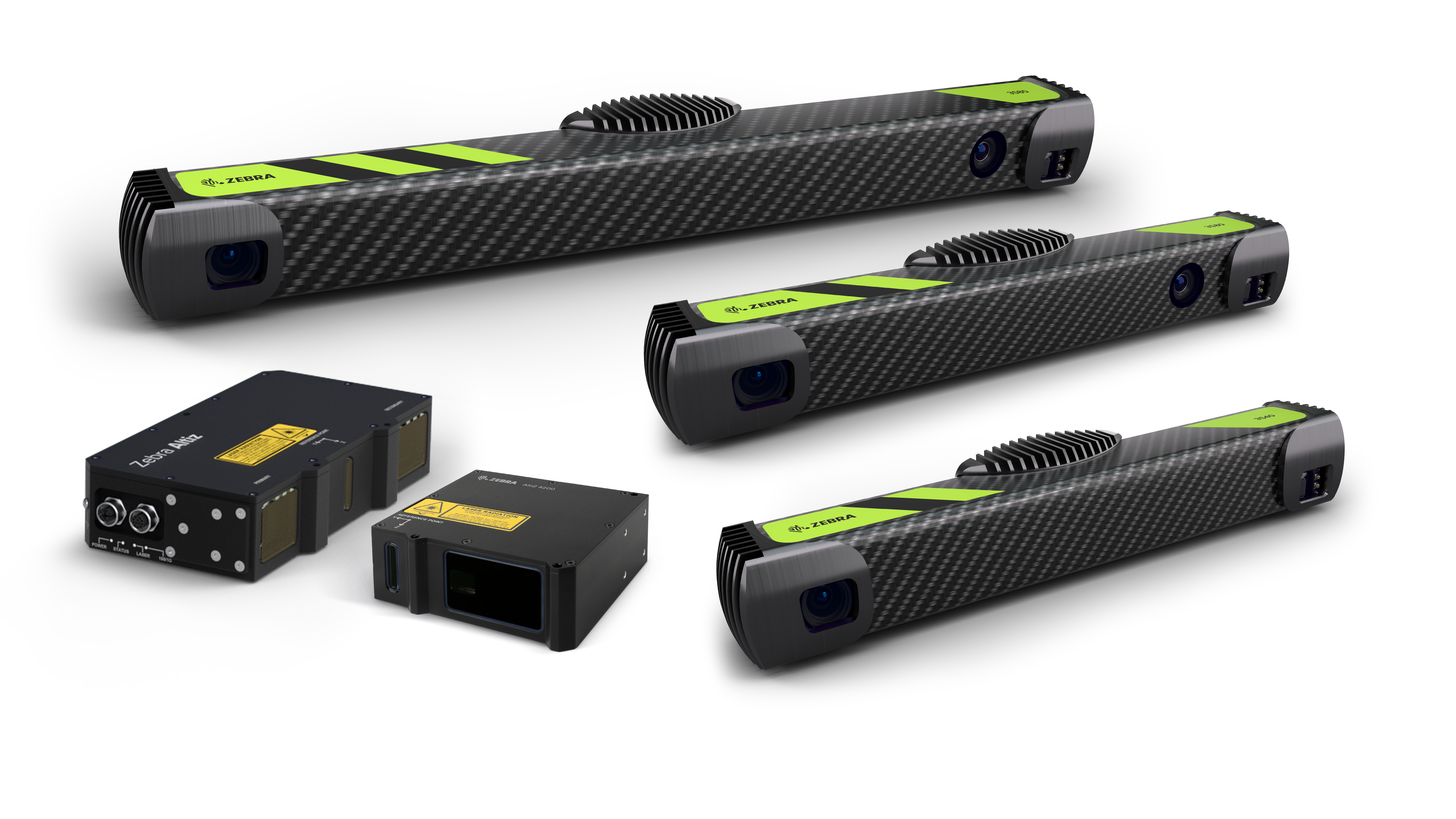
Revolutionizing Automation: How 3D Imaging is Transforming Industries
More
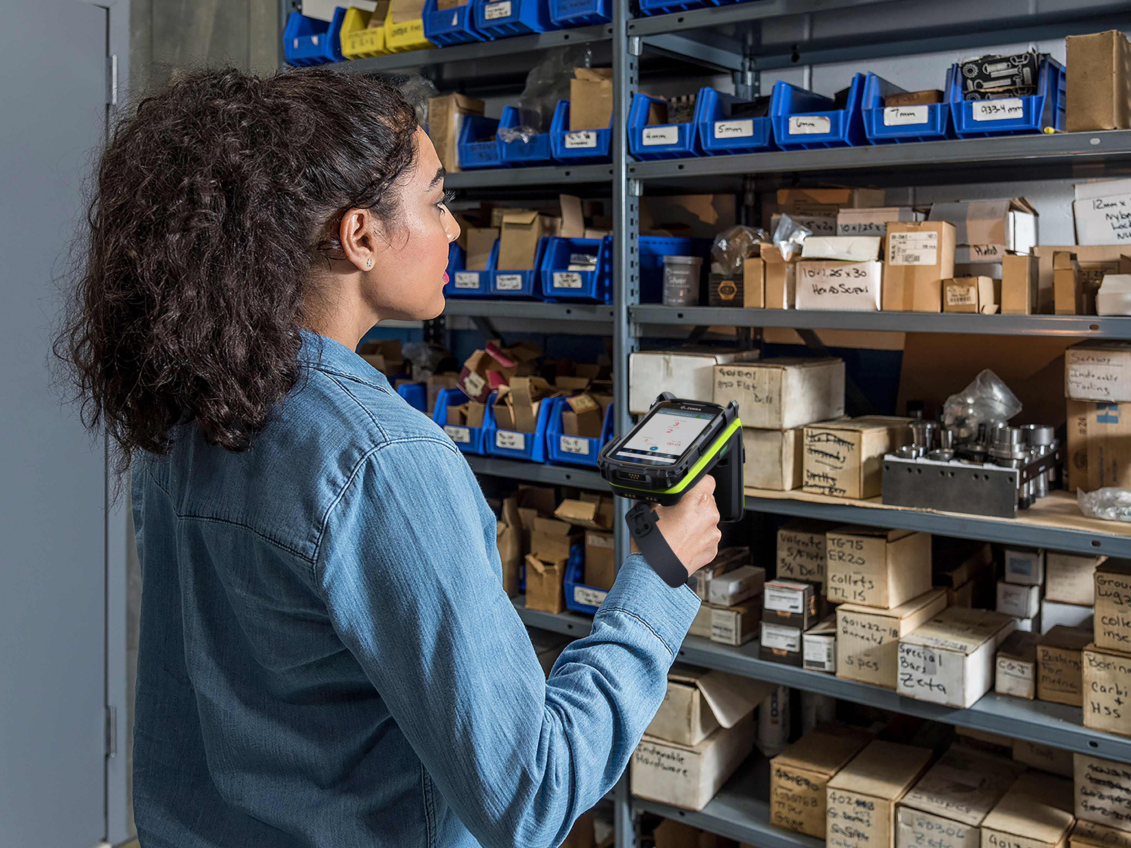
Unlocking Efficiency: Why Government Contractors Need Modern RFID Technology
More

No-Code Platform Solves Multi-Step Retail Challenges, Transforming Loss Prevention and Inventory Management
More
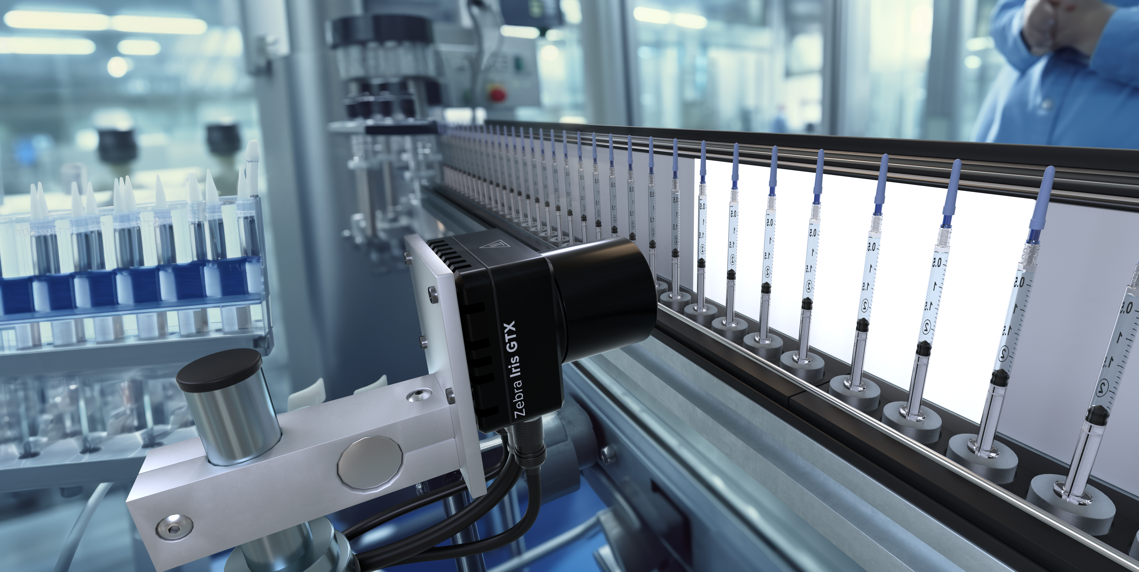
Smart Cameras: The Future of Industrial Efficiency and Precision in Machine Vision
More
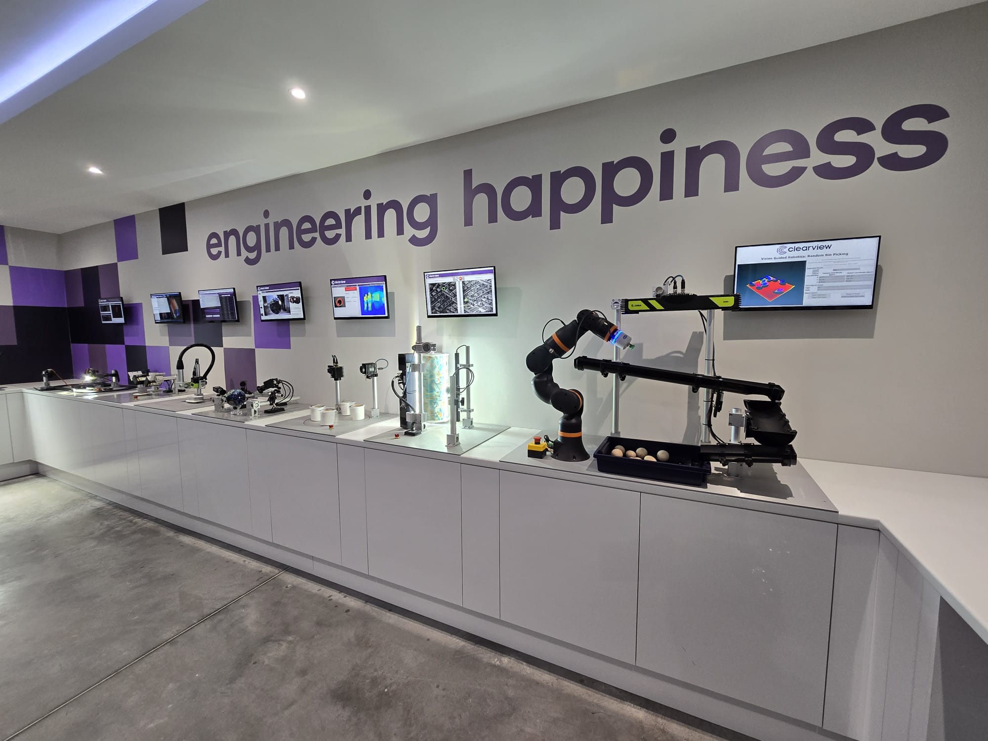
The Vision Behind Zebra’s Industrial Automation Center of Excellence
More

Auto ID Advancements Aid Inventory Management in Secure Facilities
More

Remembering Ed Kaplan: A Visionary Leader and Beloved Co-Founder
More

Robotics Can Help 3PLs Reduce Turnover and Attract Talent
More

Zebra RFID Forum Part Two: Real-World RFID Innovations and Emerging Technologies
More

Zebra RFID Forum Part One - Could This Finally be the Year of RFID?
More
Celebrating Achievements with Our Global Community
More
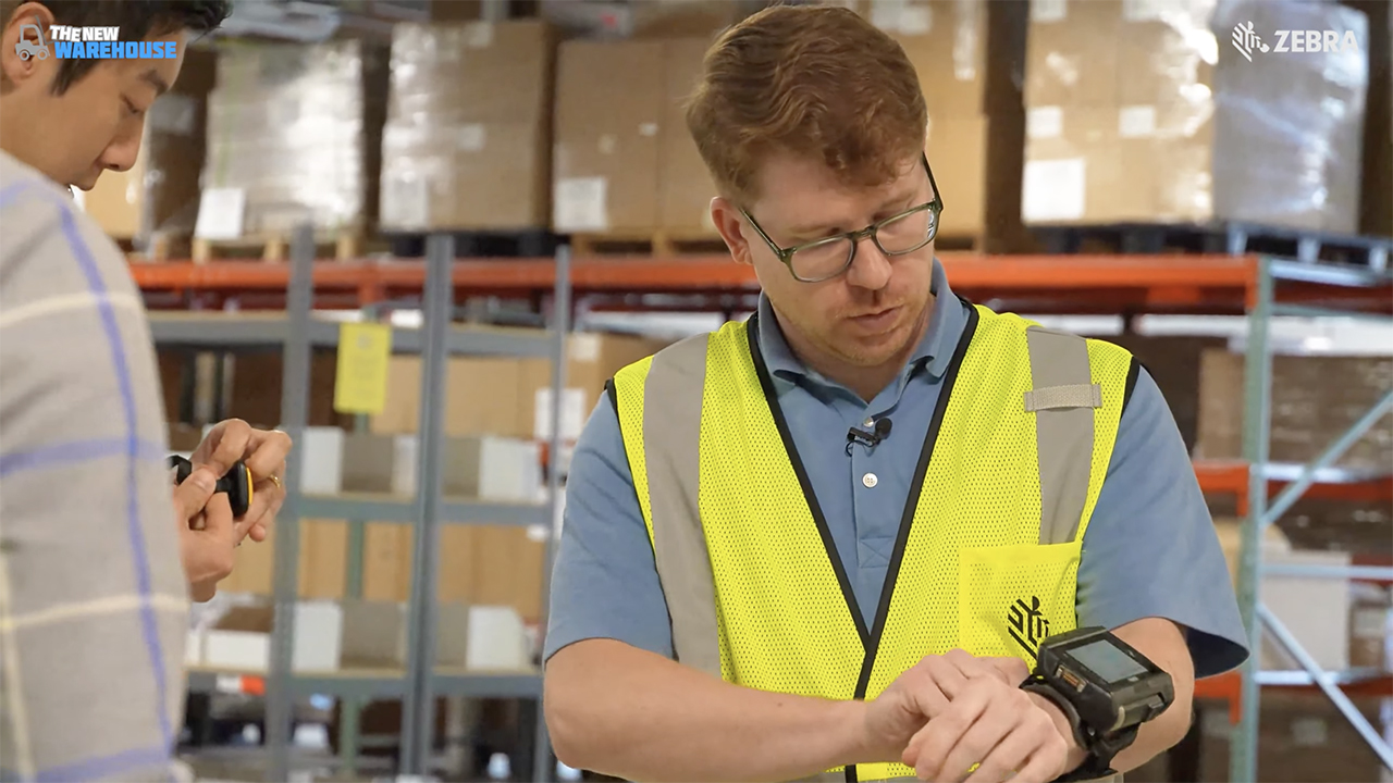
The New Warehouse Podcast Takes Zebra for a Test Drive
More

Are Hospitals Taking a Gamble on AI? Part Two
More

Are Hospitals Taking a Gamble on AI? Part One
More
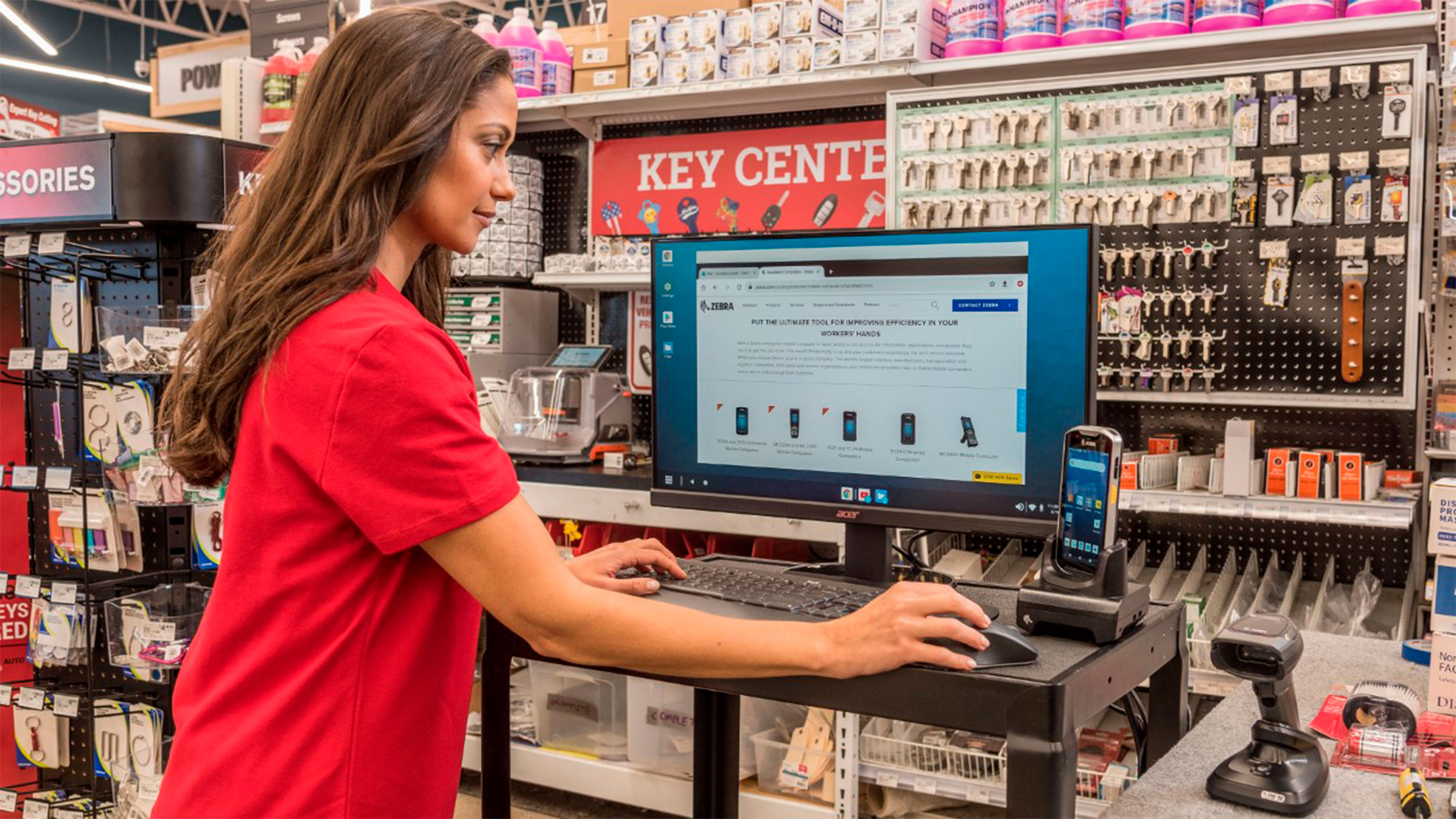
Retail’s Next Bold Move: Embracing Artificial Intelligence for the Frontline
More
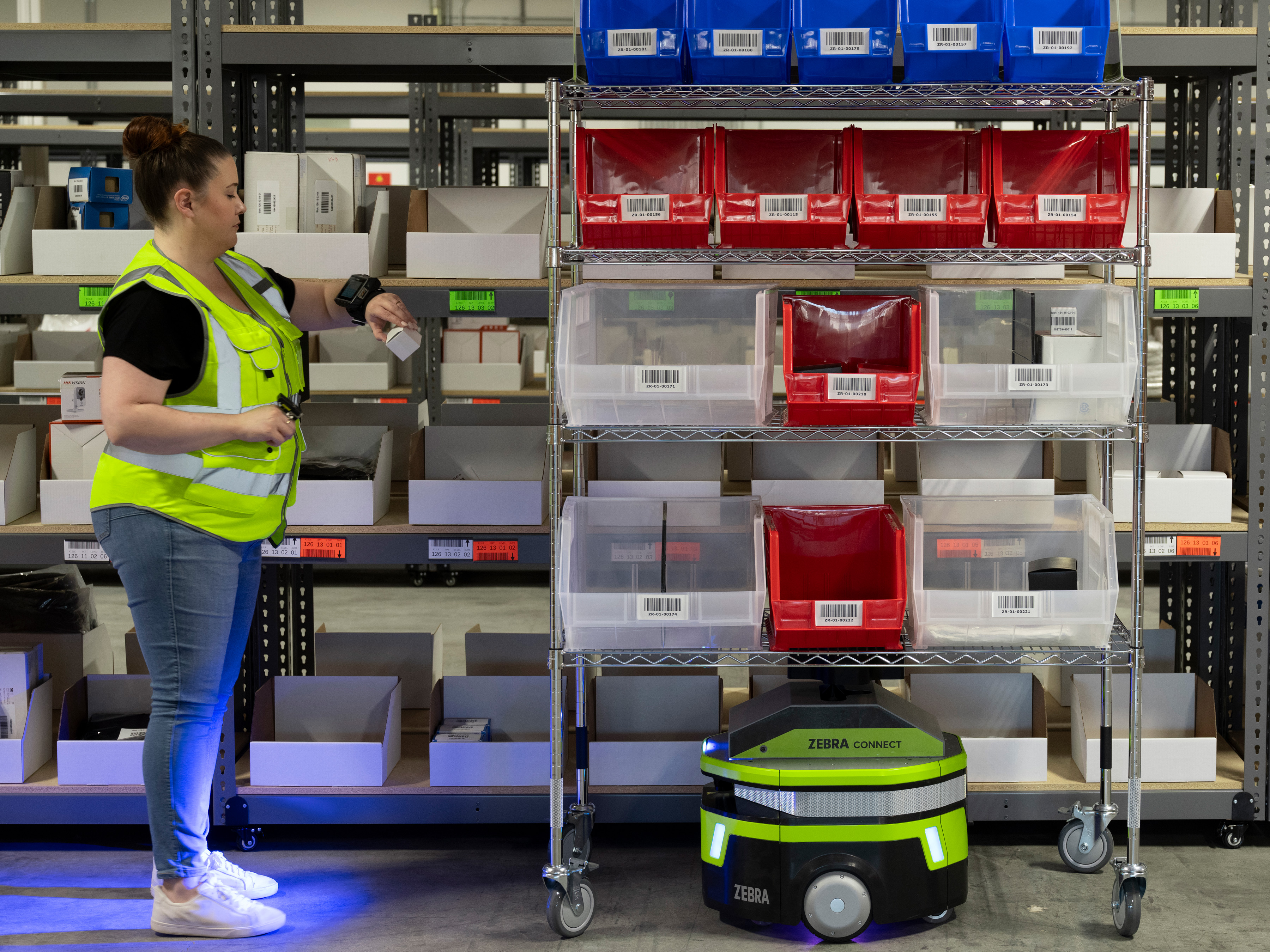
Optimize Every Second of Every Fulfillment Workflow with Up to 30% Fewer Robots
More

How a Secret Wire Tracked a Pair of Jeans Around the World
More

Chalk Talk: The Excitement Builds with the Schedule Release for the Next NFL Season
More

Transforming Patient Care Through Technology
More
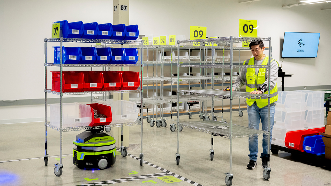
Detachable Carts Unleash the Full Potential of AMR-Assisted Picking
More
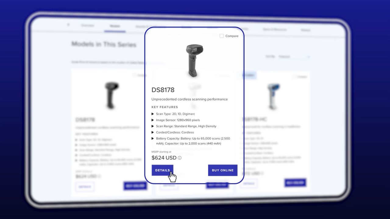
Building a B2B Commerce Ecosystem for the Modern Buyer
More

Empowering Your Business with AI: The Role of Real-Time Data Capture
More

Is There an Advantage to Moving Machine Vision Systems to the Cloud?
More

Are You a Hospital Leader Who’s Wondering What More You Can Do Right Now to Make Life (and Work) Better for People?
More

Retailers: If You’re Leaving AI Out of Pricing Strategy Decisions, You’re Leaving Money on the Table
More

The New Education Debate: Are We Teaching – and Studying – STEM the Right Way?
More

What Your Mobile Devices and Favorite Jeans Might Have in Common
More

What Do You Do When You Realize Your Career No Longer Aligns with Your Values or Life Goals?
More

AI is Showing Up in Rugged Tablets in New Ways. But This May Be One of the Most Meaningful on the Frontline Right Now.
More

How to Achieve Ethical Quality Assurance (QA) for Your Software Using Artificial Intelligence (AI)
More

Ask a Partner About the Mistakes That Were Made
More

Clini-Chat: Do You Have the Right People Informing Your RFID Projects? (Possibly Not, Says These Two Solution Engineers)
More
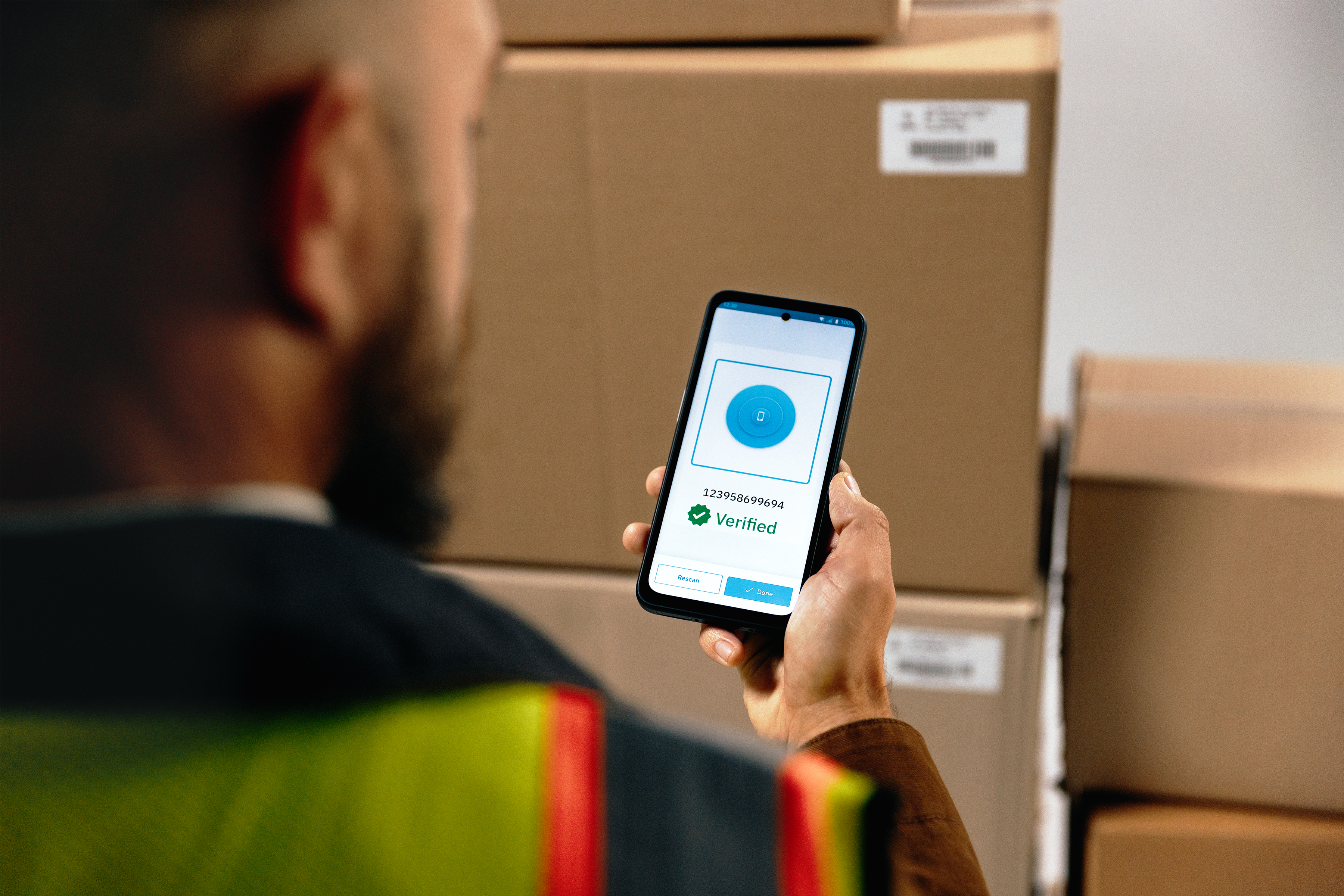
Is This Why a Stable Wi-Fi Connection Remains Elusive in Warehouses and Distribution Centers (DCs)?
More

The Magic of Technology Begins and Ends with Partners
More

Wish Your Workers Could Get More Done, Move More Efficiently, and Be More Accurate? Sounds Like It’s Time for a Game!
More

Rack Room CIO Reveals How He Uncovered and (Started Extinguishing) Over Four Dozen Friction Points in Stores
More

SAP Mobile Advisor | Choosing Your Future WMS for SAP S/4HANA: Extended Warehouse Management vs. Stock Room Management
More

Do Your Retail Associates Have the Tools They Need to Act Fast in Emergency Situations?
More

Is Enough Being Done to Protect Football Players and Other Contact Sport Athletes?
More

Hats off to the Humble Patient Wristband
More

When to Buy Tech Products Online
More
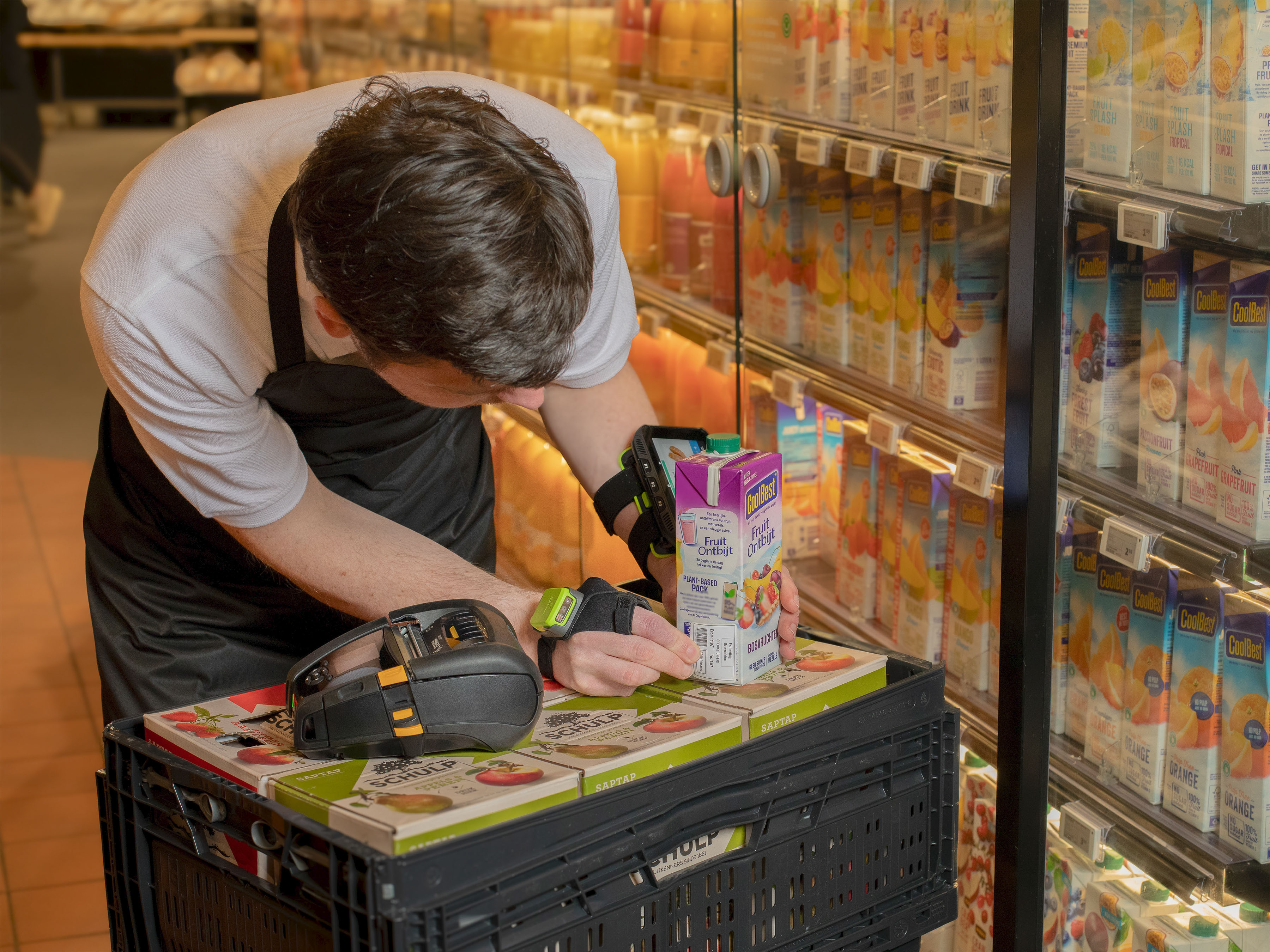
How to Integrate Pricing and Trade Promotions Strategies into Your Demand Planning
More

Walking the Talk: How We’re Engaging in Responsible AI Practices at Zebra
More

Walking the Talk: How We’re Engaging in Responsible AI Practices at Zebra
More

“Why I ‘Zoom in to Zoom Out’ When Considering Workplace Experience of Customers and Users”
More
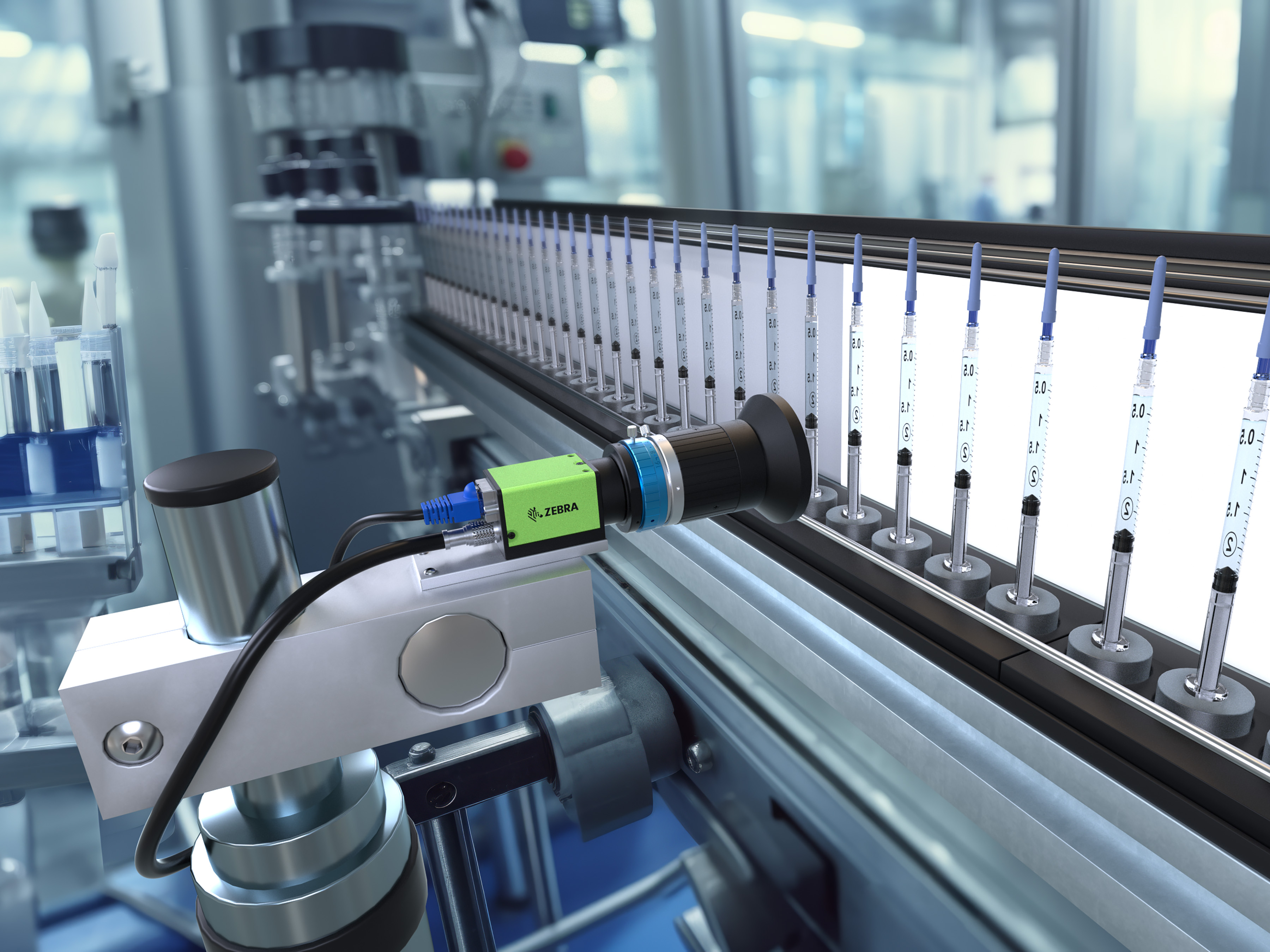
These are the Questions to Ask Every Time You’re Assessing a New Machine Vision Project for a Production or Distribution Environment
More

How Convenient Is It to Shop in Your Stores? (Do You Really Even Know?)
More

It’s Time to Let Go of Your (Business) Traditions
More

Exclusive Interview: How Unique Experiences and Exemplary People Have Helped Ground and Propel Nelda J. Connors Throughout Her Award-Winning Career
More

Seven Things to Think About Before You Consider Letting Your Home Health Providers Use AI for Patient Care, Documentation, or Other Duties
More

How to Improve Team Efficiency Through Scrum
More

Why Is Shopper Satisfaction Declining?
More

These Veterans Didn’t Let the Military Become Their Identity – and You Shouldn’t Either
More
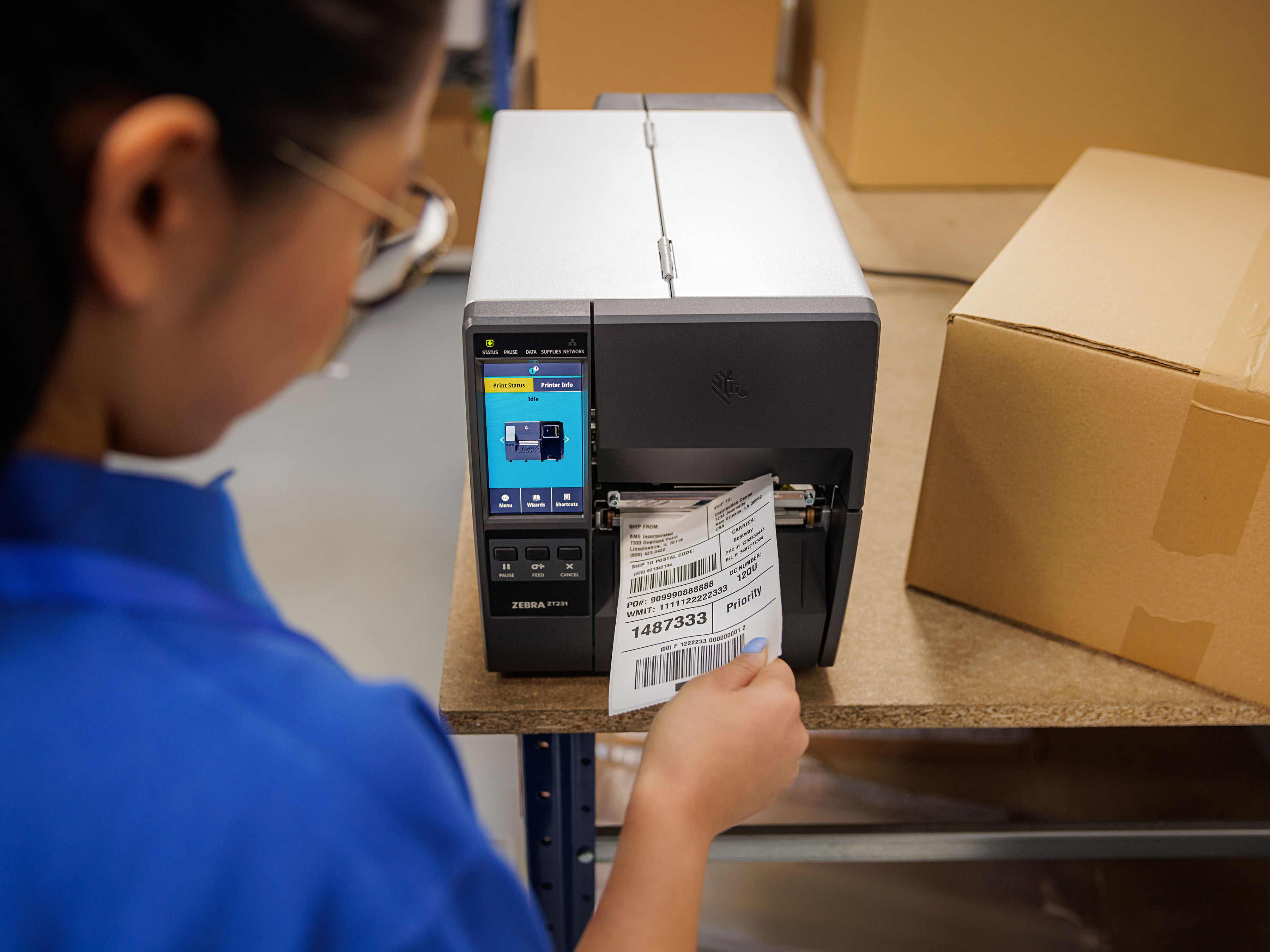
Free App Makes It Simple for You to Setup and Connect Android Mobile Devices to Your Zebra Printers
More

Having a “Secure Network” or “Secure Devices” Isn’t Enough Anymore. So, What Is?
More
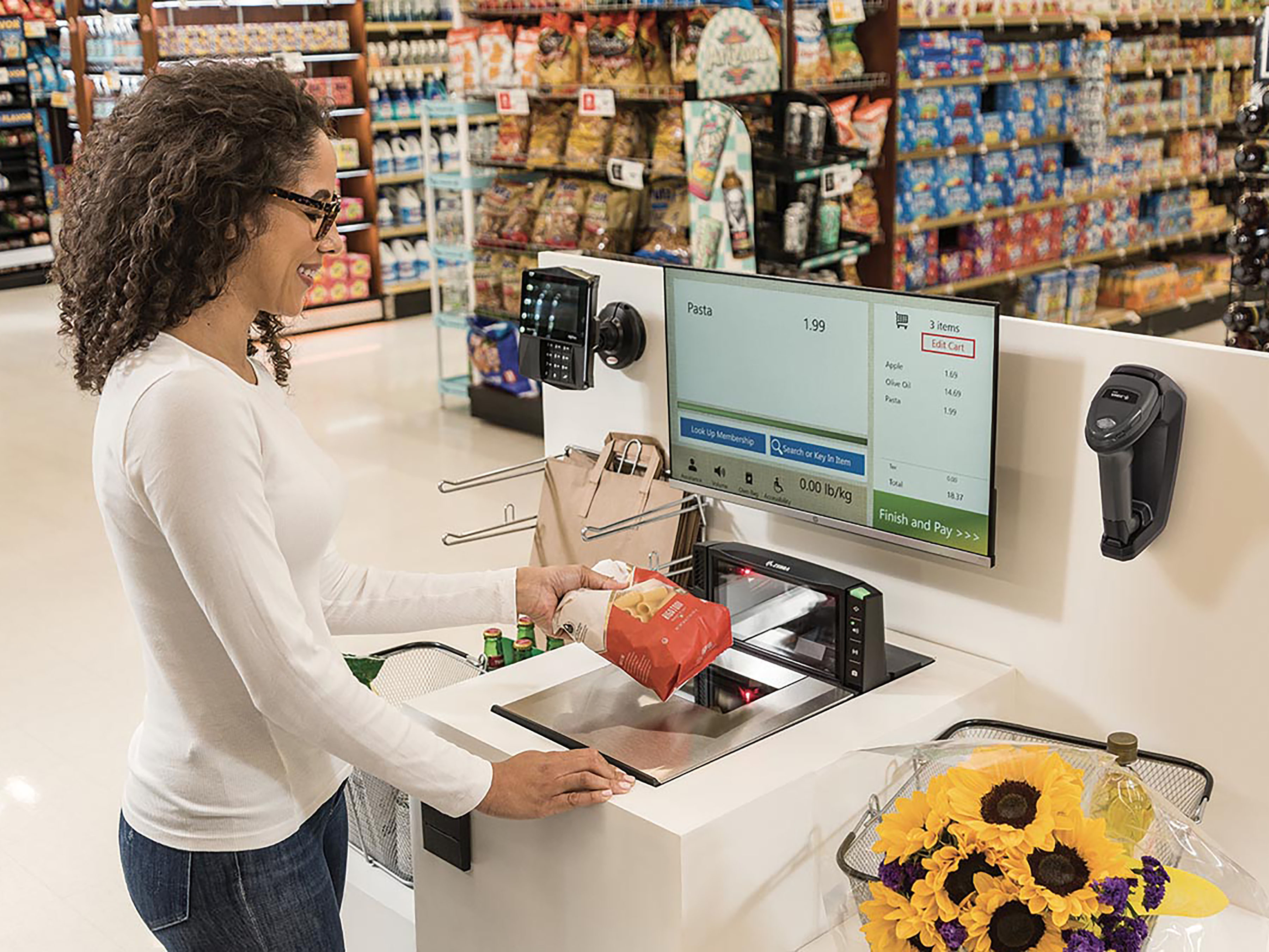
Is Convenience the Key to Achieving an Elevated Shopping Experience?
More

Delivering Over the Past Decade and Continuing to Support the Frontline for Years to Come
More
Doing These Things Can Reduce Your Anxiety in Moving to Android 14
More
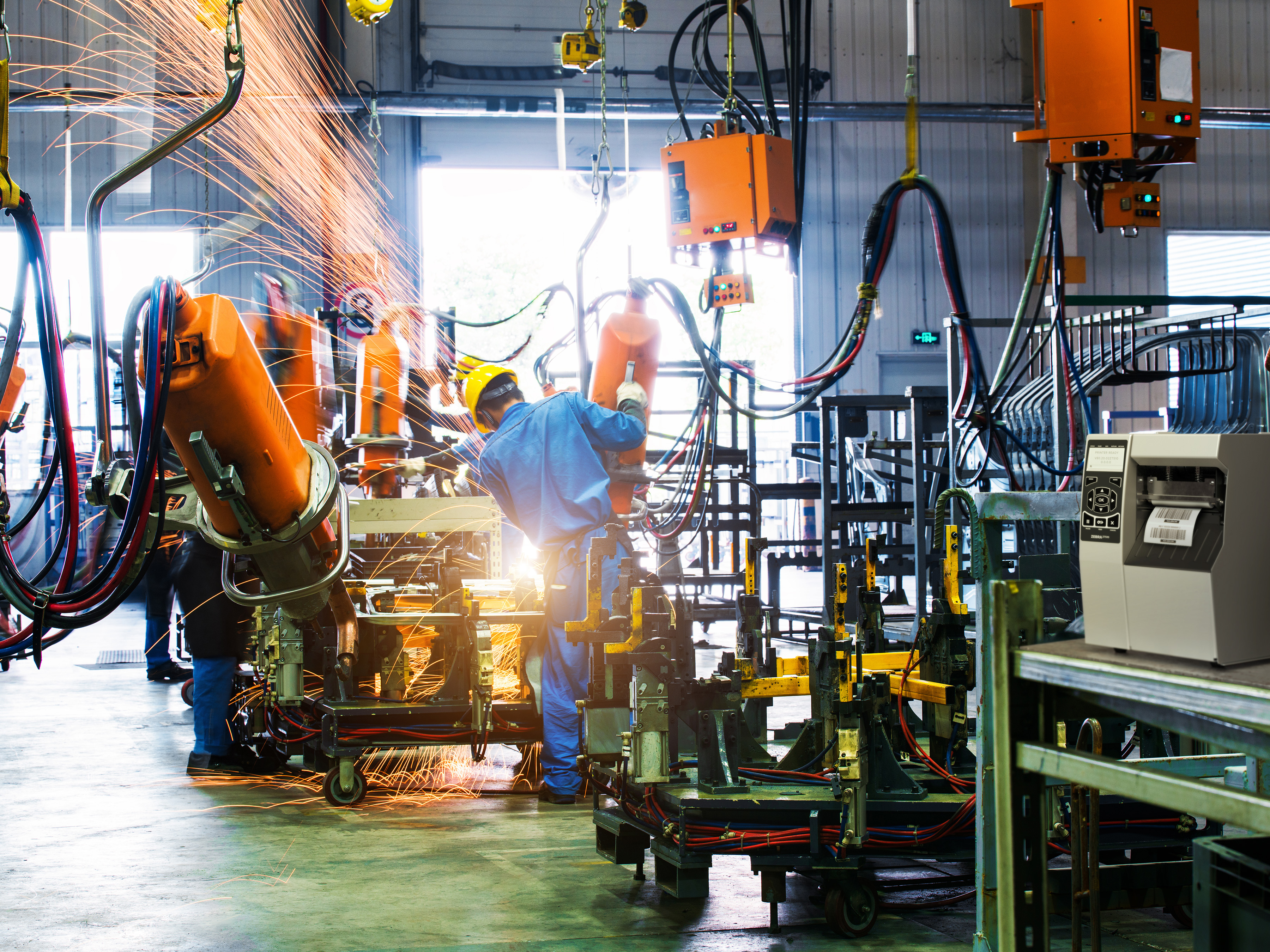
A Look at Labor: How to Make the Ongoing “Manufacturing Skills and Labor Challenge” a Non-Issue
More
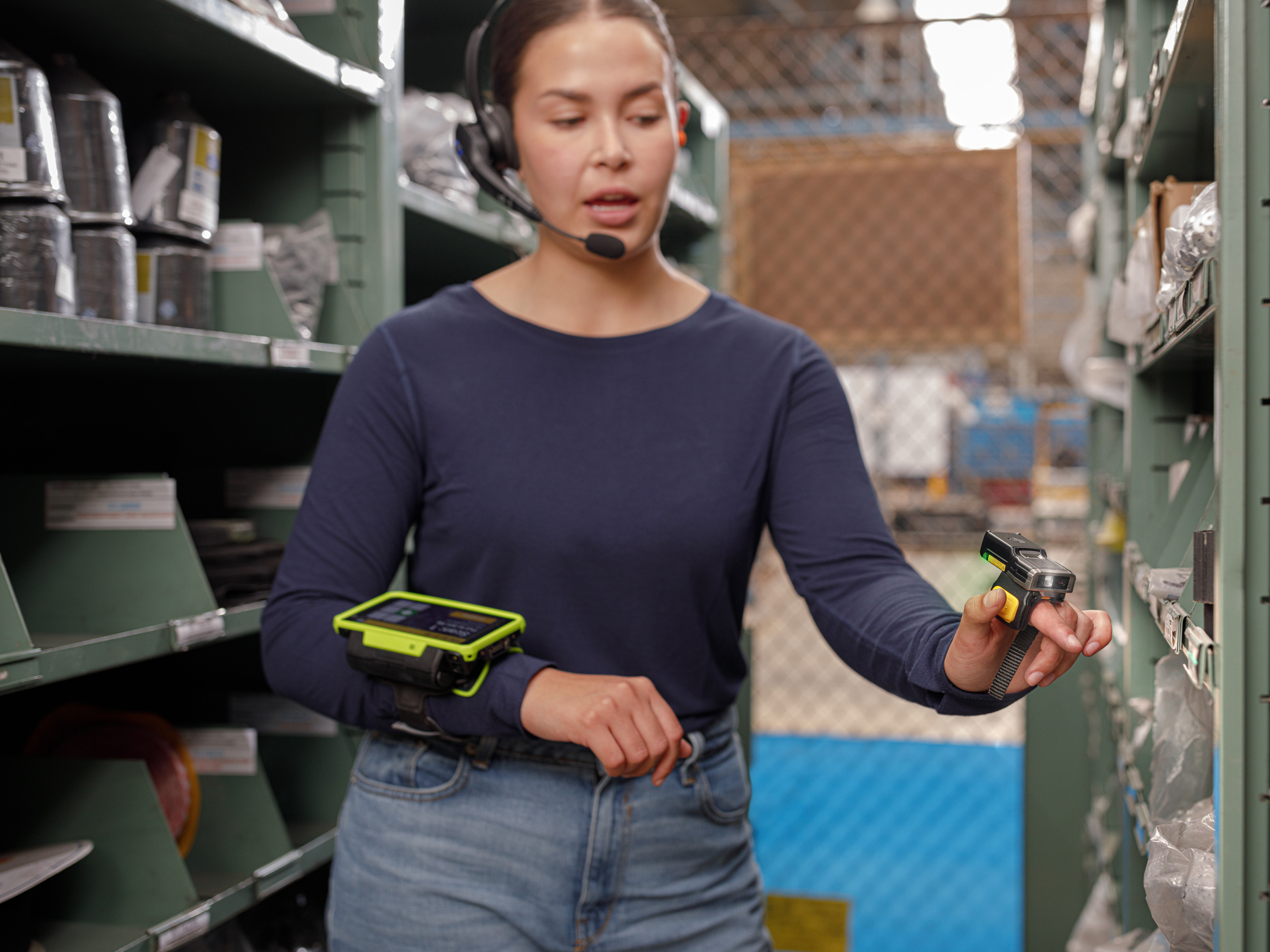
What People Aren’t Telling You About Voice Technology
More

What It Was Really Like to Come Out…as Asexual, with ADHD, as Gay, and Then Finally as My Fully Authentic Self
More

Is AI Really What Home Health Providers Need Right Now?
More

Ask the Experts: Is On-Device AI Going to Prove to Be Hype or Helpful?
More

The Many Reasons Why You Should be Automating – and Incorporating Artificial Intelligence (AI) into – Your Demand Planning
More

How to Enable Offline Workflows and Transactions with SAP Mobile Apps
More

These are the Changes You Can Make Right Now to Help Reduce Food Waste (and Protect Your Bottom Line)
More

Ask the Expert: “How Can I Put Responsible AI Into Practice?”
More
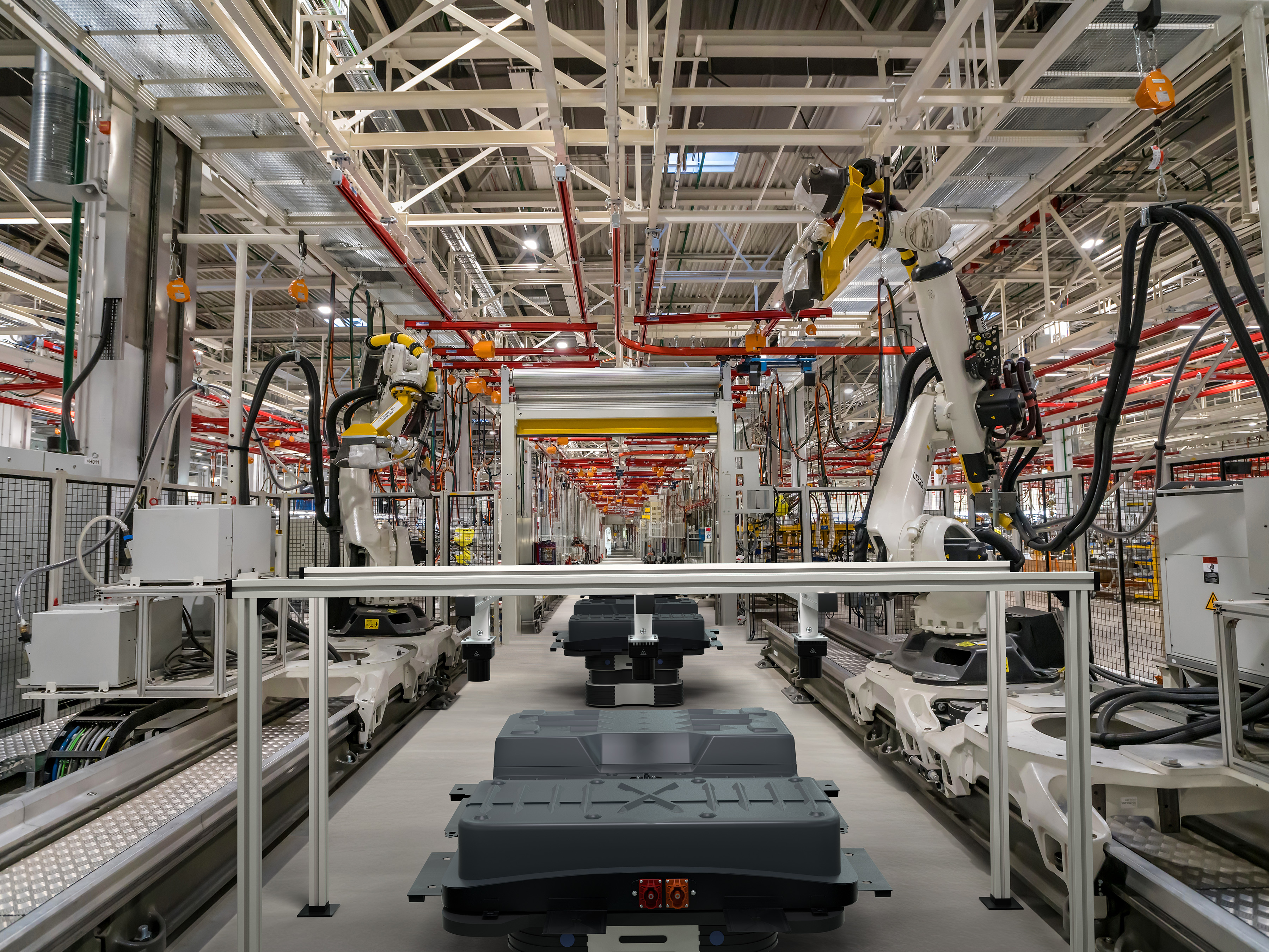
The One Question You Should Be Asking Before Deploying a Machine Vision System (Especially If You’re an Automaker or Electric Battery Supplier)”
More

Is Technology the Key to Future Proofing Our Healthcare System?
More

Food Labels aren’t the Only Labels You Should Be Checking for BPA (or BPS) Anymore
More

Skeptical that Voice Automation Technology Can Do Something AI and Other Technology Can’t? See If You Believe After Hearing This.
More

Industrial Automation Insider: What You Need to Think About – and Be Prepared to Change – When Spec’ing Out a Machine Vision System
More

Why We Should Be Gifting More Books to Increase Access to Books Around the World
More

Will Competing Priorities and Regulatory Pressures Challenge the Airline Industry’s Ability to Transform the Passenger Experience – or Simply Fuel Record Investments?
More

Chalk Talk: NFL Rookie TJ Tampa Talks about What It’s Like to Go Pro – and What He’s Been Doing to Make Sure His Coaches, Teammates and Fans Like What They See on the Field
More

Why Your “Loss Prevention” Efforts Aren’t Working
More

One Nurse’s Perspective on the Healthcare Community’s ‘Inventory Management’ Problem (and How to Fix It)
More

Wish You Could Create Digital Forms, Automate Your Form-Dependent Workflows, and Go Paperless Once and For All? It’s Not as Difficult as It Used to Be.
More

This May Be the Simplest Way to Save Lives. So, Why Don’t More People Do It?
More

Ask the Expert: How Can I Better Respond to Emergency Medical Technicians’ Calls for Help in Europe?
More

The Crucial Role of a Lead Partner in Complex IT Projects
More

Out-of-Stocks: A Hidden Crisis in Retail
More

This is Why You Must Put Your Workers’ Mobile Experiences First When Modernizing Your SAP Warehouse
More

Struggling to Find the Right Stats to Support Your Business or Marketing Strategy? The Example Set by the NFL Can Help.
More

Why It’s More Important for You to Understand “What’s New” with Voice Technology Than What’s Happening with AI or Robotics
More
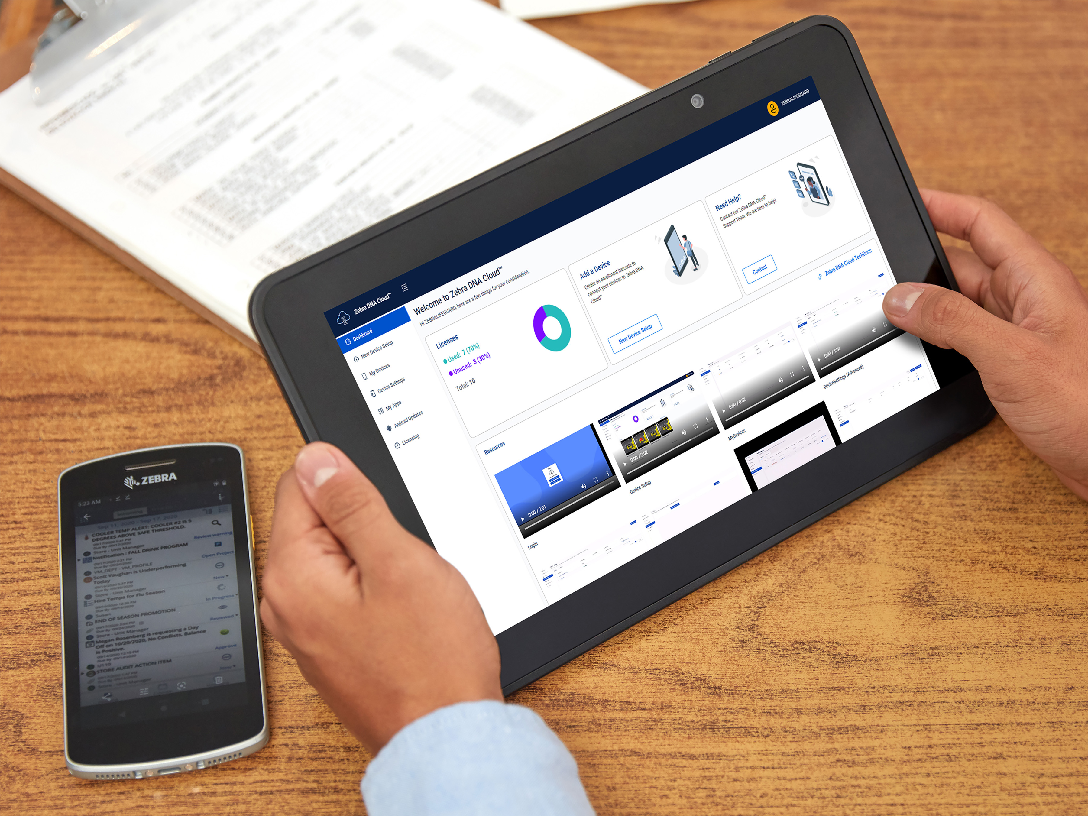
Are You Putting Enough Thought into Your Software Decisions?
More

Setting the Record Straight: AI Does Not ‘Exist to Harm or Take Over Things’ (Like Some People Have Been Led to Believe)
More

Working With Partners Means Never Going It Alone
More

Are You in The Right Zone – or on the Right Path – In Your Career? Here’s One Way to Tell.
More

Really Want to Stop Shrink at the Point of Sale (POS)? Rethink What a ‘Scan’ Should Look Like – and Look For.
More

It’s the Little Things That Matter Most to Your Business, Especially When It Comes to Choosing (and Being Happy with) Your Barcode Scanners
More

Curious What’s Really Happening Over the Road? Want to Better Track and Manage Goods in Transit?
More

‘What’s the Right Way to Train Employees on New Hardware Capabilities or Software Applications? And Do I Need to Outsource Training or Can I Manage It In-house?’
More

Chalk Talk: The “Uncommon” Things that Coach Sean Payton Wants His Players to Do Each Day Might Surprise You
More

Industrial Automation Insider: Why It’s Good to Look at Machine Vision Through Different Generational Lenses (According to Engineers from Two Different Generations)
More

Recognition Reflects Our Incredible Culture at Zebra
More
![Fox Robotics autonomous forklift blog, [Category, Subcat or Product] Representational Image 1800x450 Fox Robotics autonomous forklift blog](/content/dam/zebra_dam/global/zcom-web-production/web-production-photography/web004/warehouse-photography-website-blog-fox-robotics-autonomous-forklift-3600x2700.jpg.imgo.jpg)
Investing in Logistics: Identifying Disruption to Stay Ahead of the Pack
More

Six Features of a Good Inventory Formula and Five Features You Can Ignore
More

This is What It Really Means (and Takes) to Be an Ally
More
Why – and How – Walgreens is Removing Friction to Stop Revenue from Walking Out the Door
More

Why Basic Inventory Data Isn’t So Easy
More

If Your Front-line Workers are Still Using These Popular Android Mobile Devices, You Could Be Putting Your Business at Risk in At Least Four Different Ways
More
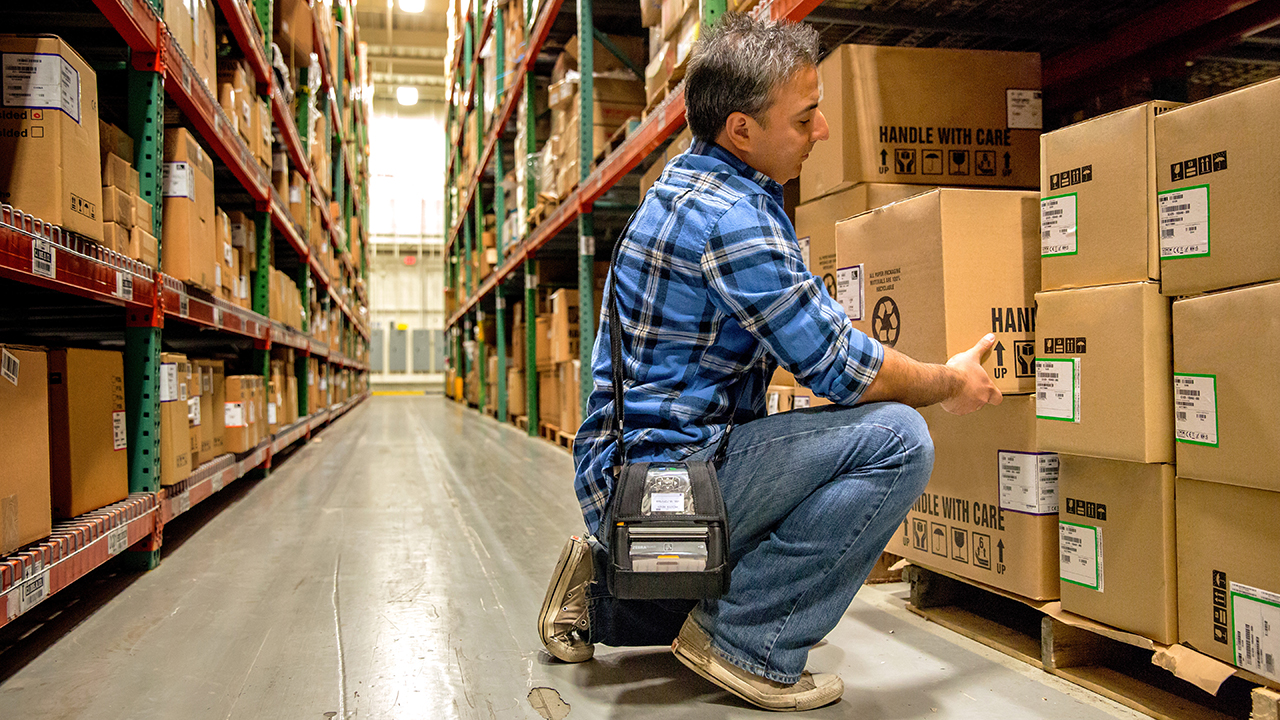
Do You Have the Right Type of Protection Plan for Your Business’ Mobile Devices, Scanners and Printers? (I Only Ask Because Most Organizations Don’t.)
More
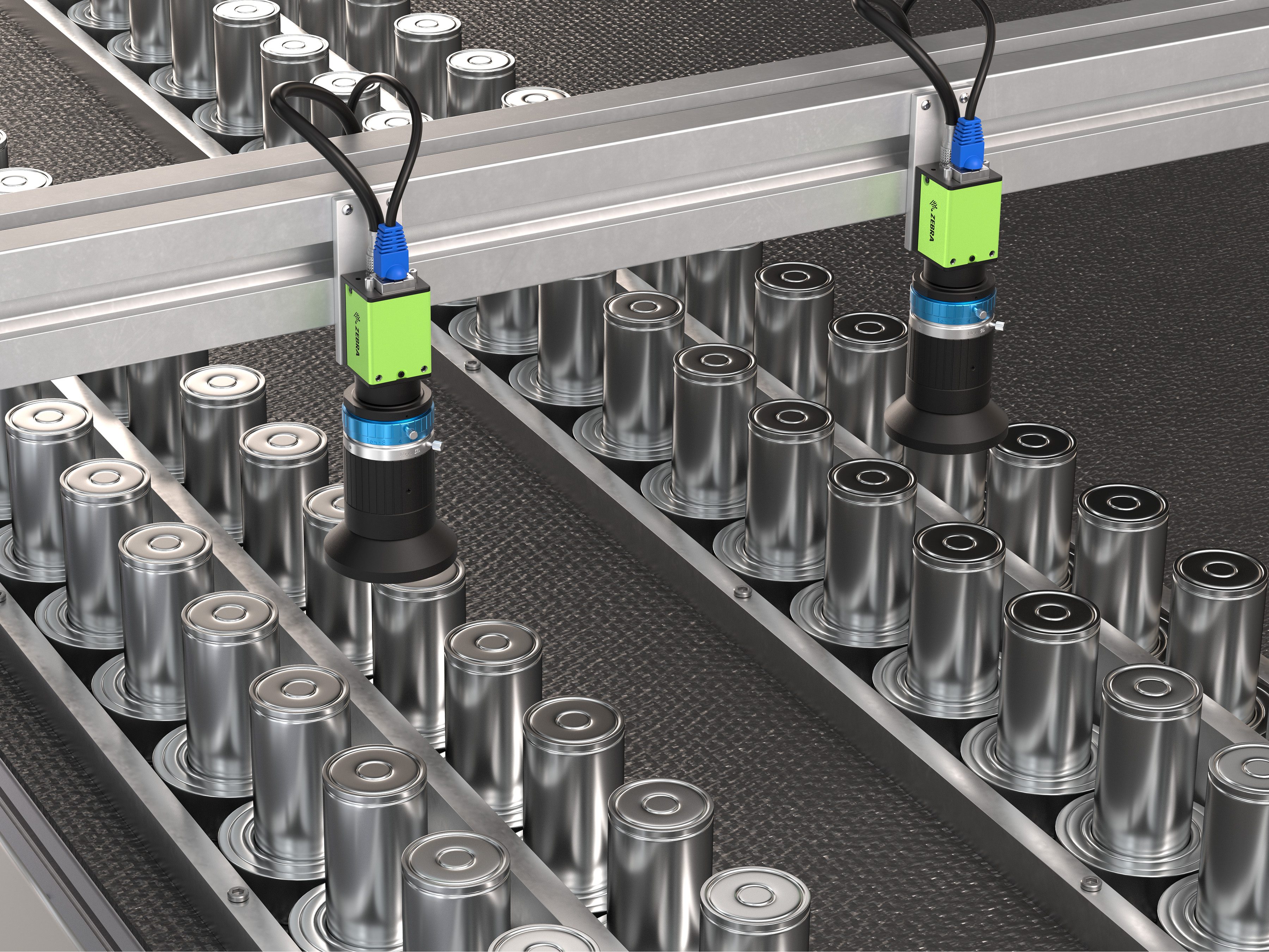
Everyone Says AI is Going to Make Machine Vision – and Electric Vehicle Quality Inspections – ‘So Much Better’ – and It Will. But There are Other Things that Will Make a Bigger Impact.
More
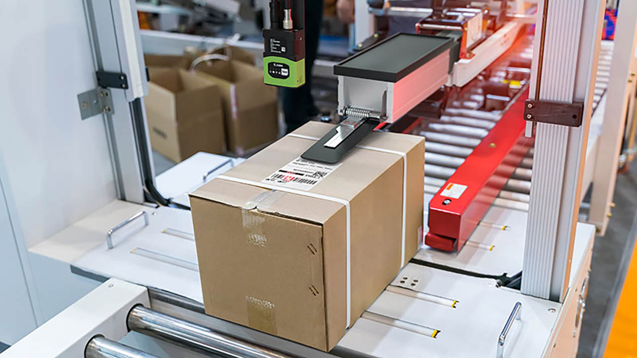
Industrial Automation Insider: Check Out the Novel Ways that Traditional Print-and-Apply Labeling Systems are Being Used on Production and Packing Lines
More

What Will It Take to Make Direct Store Delivery More Manageable and Cost-Effective?
More

How One Airline is Using RFID to Mitigate the Risks of Rushed Cabin Inspections
More

Want More Companies to Choose You – and Keep You – as Their 3PL Partner? Here’s What You Might Need to Do Differently.
More
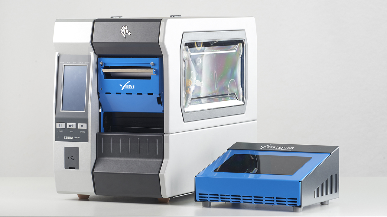
Want to Be 100% Sure You’re Printing Accurate Labels …Before They Come Off the Printer?
More

Ask the Expert: “Can a Good Company Culture Improve My Bottom Line, As Some People Claim?”
More
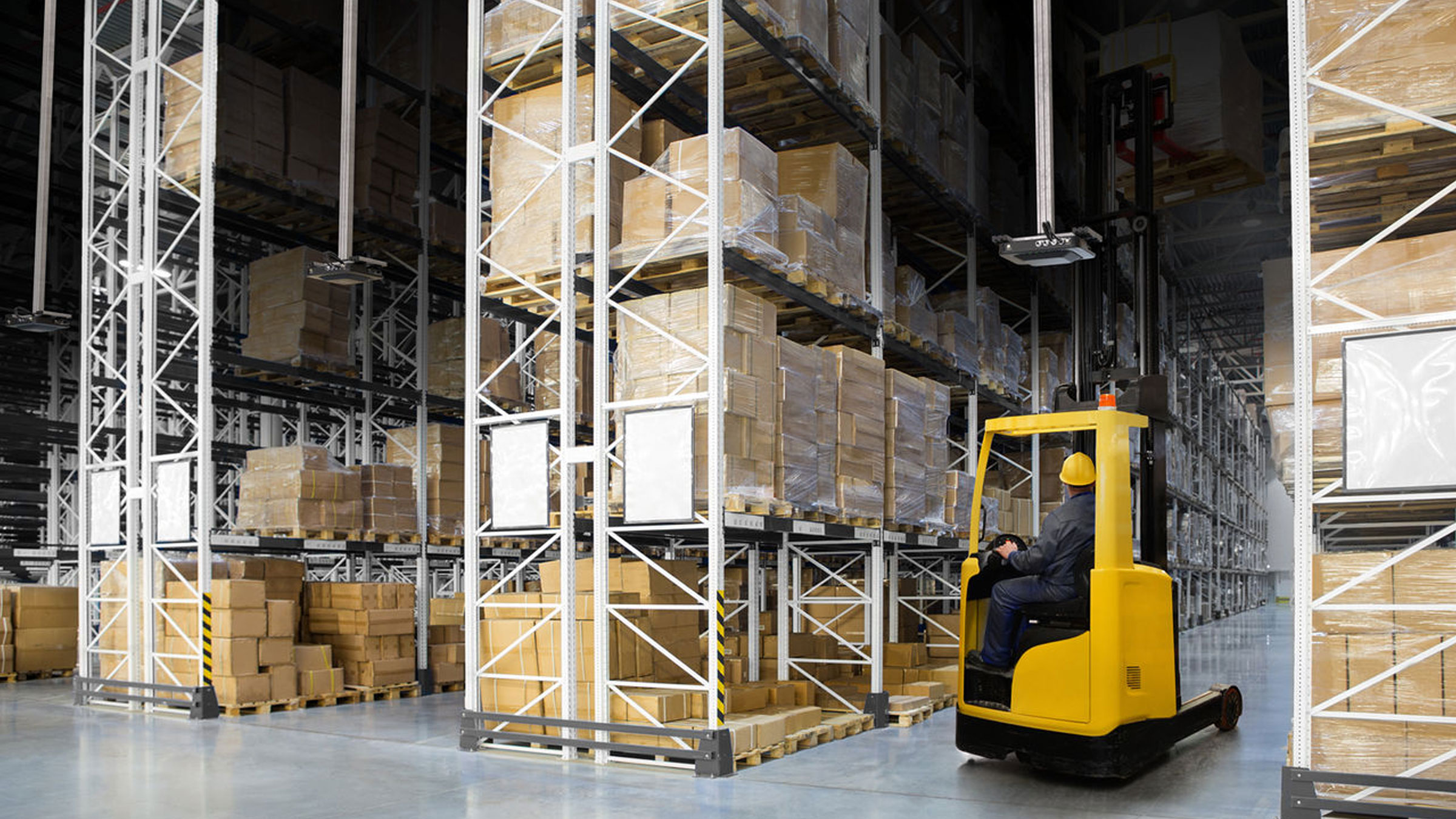
An Inventory Quote and Story: Educational Lessons on Root Causes and Controlling Inventory
More

Plan to Put AI to Work for Your Business? Just Make Sure There’s Always a Human in the Loop.
More

HIMSS 24 - A Rollercoaster Ride in Healthcare Trends
More
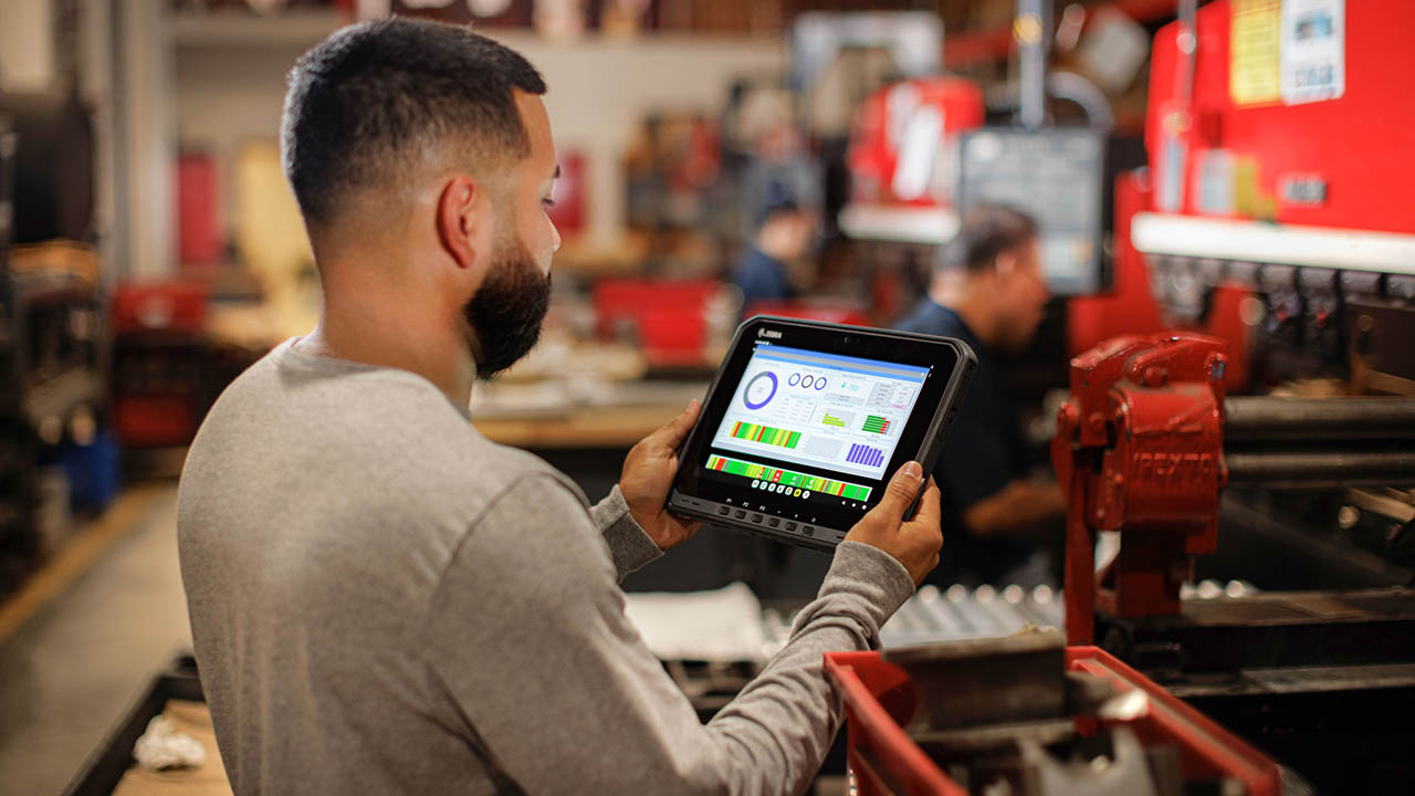
What’s Missing from the IT/OT Convergence in Many Manufacturing Environments?
More
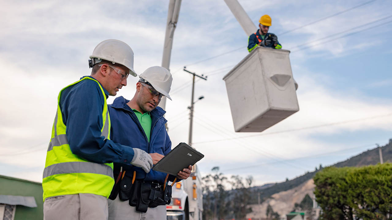
What Are You Doing to Ensure Your New Utility Workers Can Keep Up with Retirees?
More
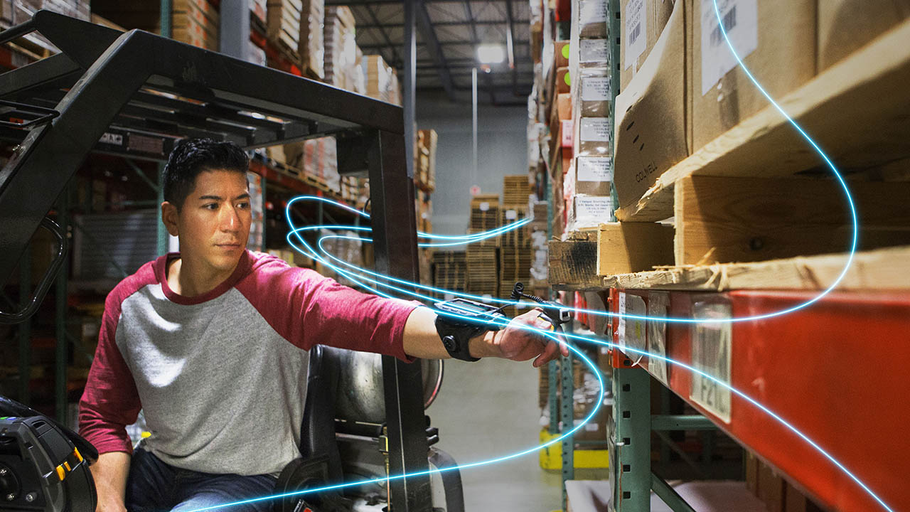
Will There Ever Be a Communication Technology Standard with More Staying Power Than Bluetooth?
More

Three Ways a Good Inventory Formula Helps You Reduce Inventory
More

We’re Moving to More Paper-Based Supply Chain Processes as the Demand for More Technology Grows (and Our Customers are Going to Benefit in a Big Way)
More

Artificial Intelligence is Eating Exception-Based Reporting (EBR) Tools
More

What to Know Before You Try to Train (and Test) a Deep Learning Application
More

Don’t Swing Between Just-in-Time and Just-in-Case. (There’s a Better Framework.)
More
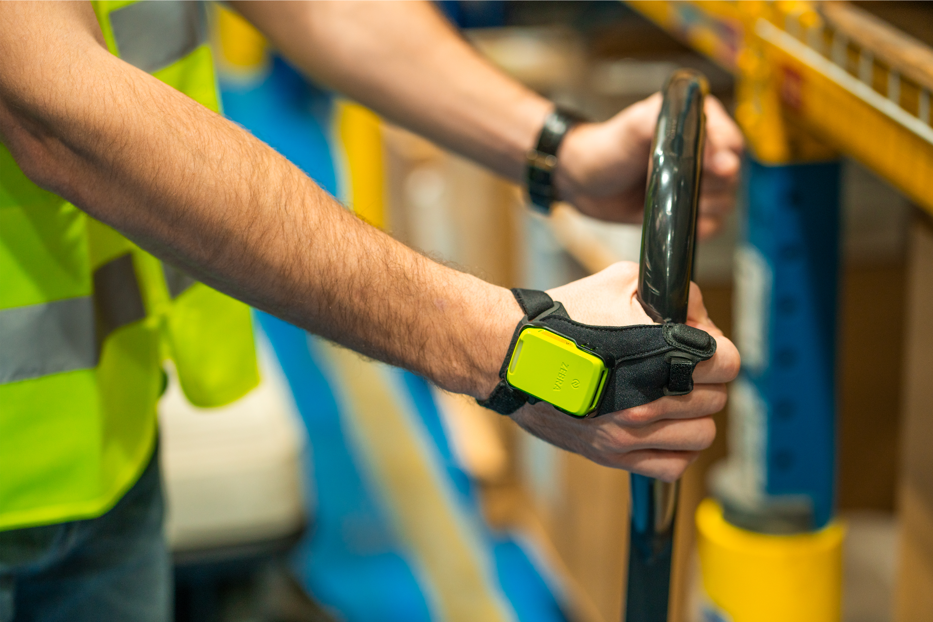
One Million Hours Worked, Zero Safety Incidents: Here’s How We’ve Kept Our Manufacturing Team Healthy and Productive for So Long
More

Banking’s New Frontier: Are Your Branch Employees Ready for the Digital Age?
More

You May Have Found a Way to Be Compliant with DSCSA, but Are Those System and Process Changes Making Any Difference Elsewhere in Your Organization?
More

Is It Really Possible for Consumer Packaged Goods (CPG) Companies and Retailers to Predict – and Plan for – Future Demand?
More

On a Mission to Improve Your Global Supply Chain Operations? So Am I.
More
![[Category, Subcat or Product] Representational Image 16:9 pg-web-hero-event-partner-ignition-series-retail-16x9-3600.jpg](/content/dam/zebra_dam/global/pg-web-production/pg-events/pg-web-hero-event-partner-ignition-series-retail-16x9-3600.jpg.imgo.jpg)
My Take: Four Ways AI Will Make Retail Better
More

Meet the Woman Behind One of Zebra’s First Value-Added Resellers (VARs) – and One of the Tech Industry’s First-Ever Tech VARs
More

Quick Service, Smart Solutions: How You Can Use RAIN RFID to Optimize Your QSR Operations
More
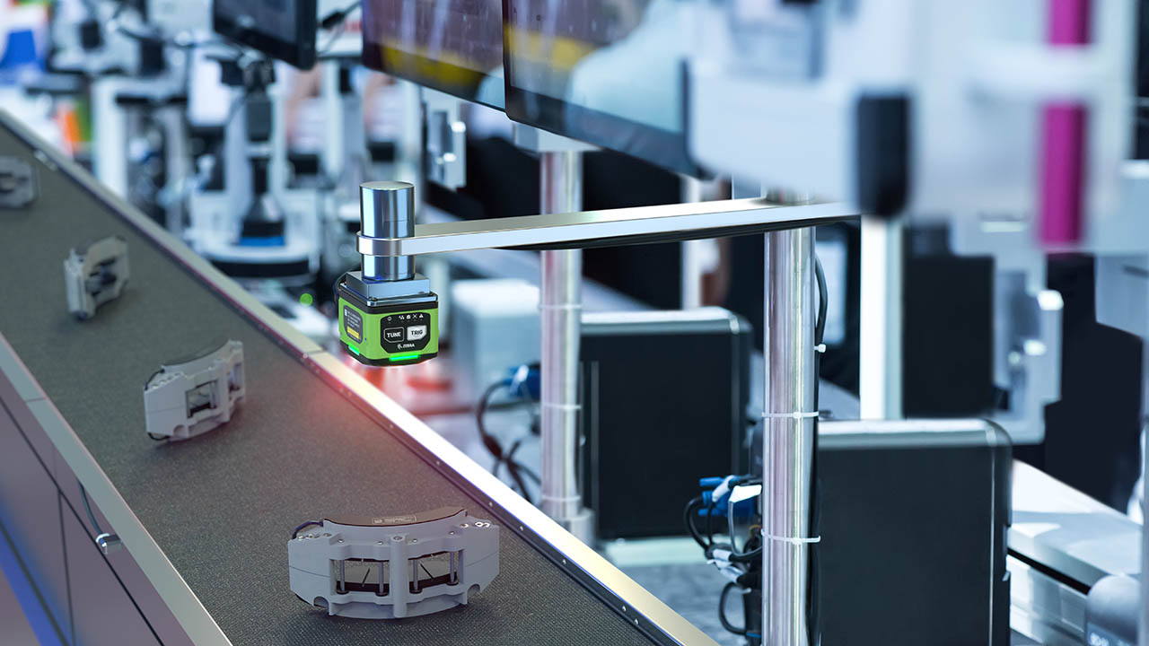
Machine Vision: Is It a No Brainer or Too Good to Be True?
More

This is How 2D Barcodes Can (and Should) Be Used in Healthcare Settings
More

When Sustainability and Security Align
More
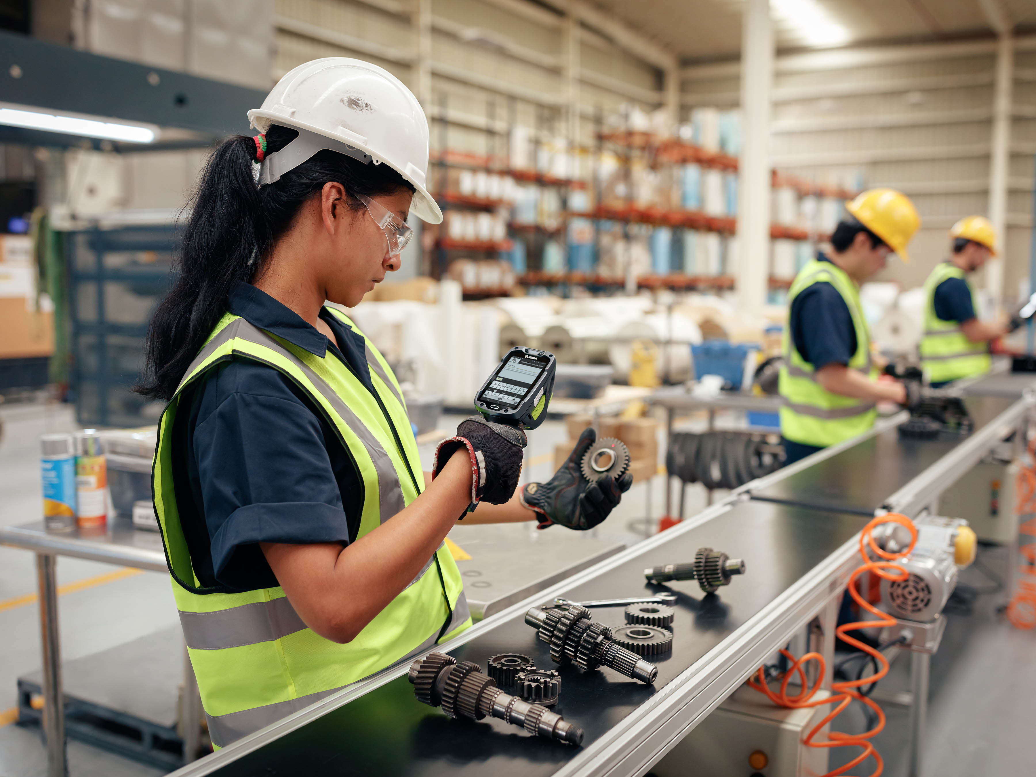
Wish You Could Easily Customize the Mobile Device User Experience for Your Front-line Workers? You Now Have Lots of Options
More

There are So Many Ways to Invest in and Inspire Women. Here are the Ones Inclusion and Diversity Champions Find Most Helpful.
More

Chalk Talk: Do the Dallas Cowboys Have What It Take to Rebuild Their Dynasty? Could They Play Ball with the Kansas City Chiefs in Super Bowl LIX? RJ Ochoa Joins Us for Some Real Talk.
More

The Future of All Business: Proximity, Scale and Business Model Innovation
More

The Art of Tech Engineering – and the Impact of Tech Engineering on the Arts: A Black History Month Perspective
More

The Truth About Connectivity in the Warehouse: Green-Screen Apps
More
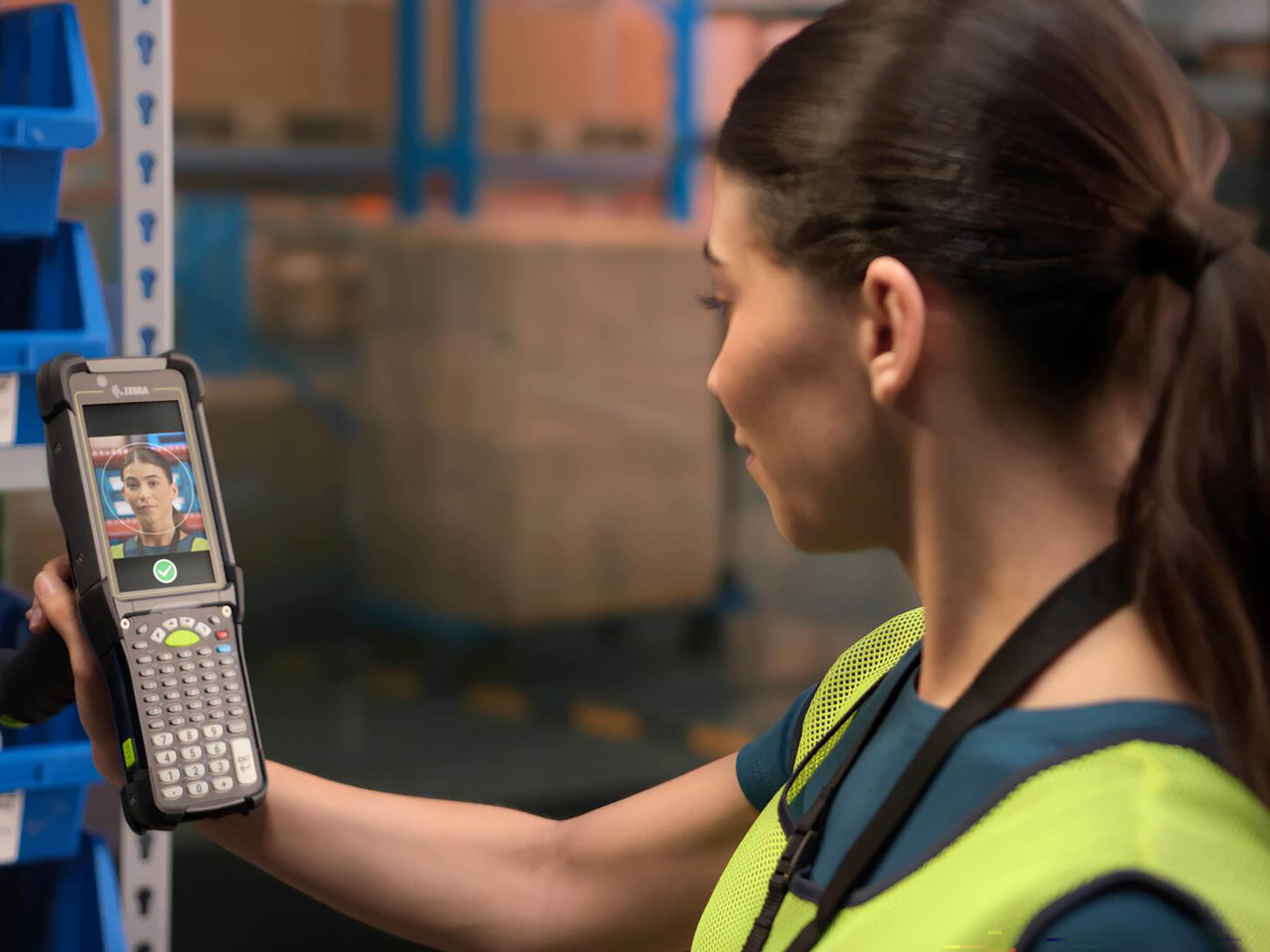
There’s a New Way to Secure Your Organization’s Shared Mobile Devices (and Speed Up Device Access for Front-line Users)
More
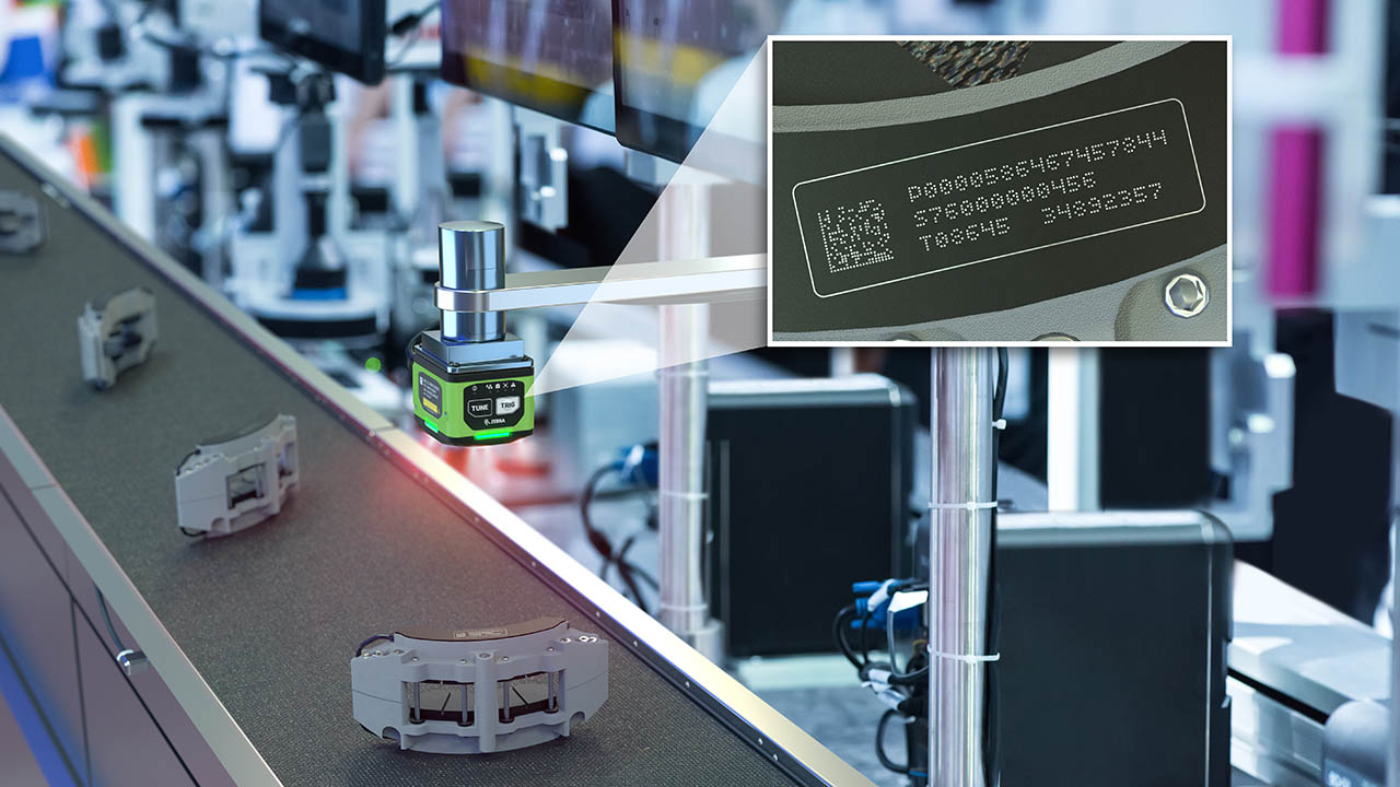
A Deeper Dive on Deep Learning OCR
More

How to Do More…With More: Advice from Someone Who Found It Impossible to “Do More With Less”
More

Industrial Automation Insider: What Role Should RFID, Machine Vision and Other Automation Technologies Play in Reverse Logistics?
More

Chalk Talk: Thought NFL Linebacker Brandon Copeland Retired? Think Again
More

Data to Dollars
More
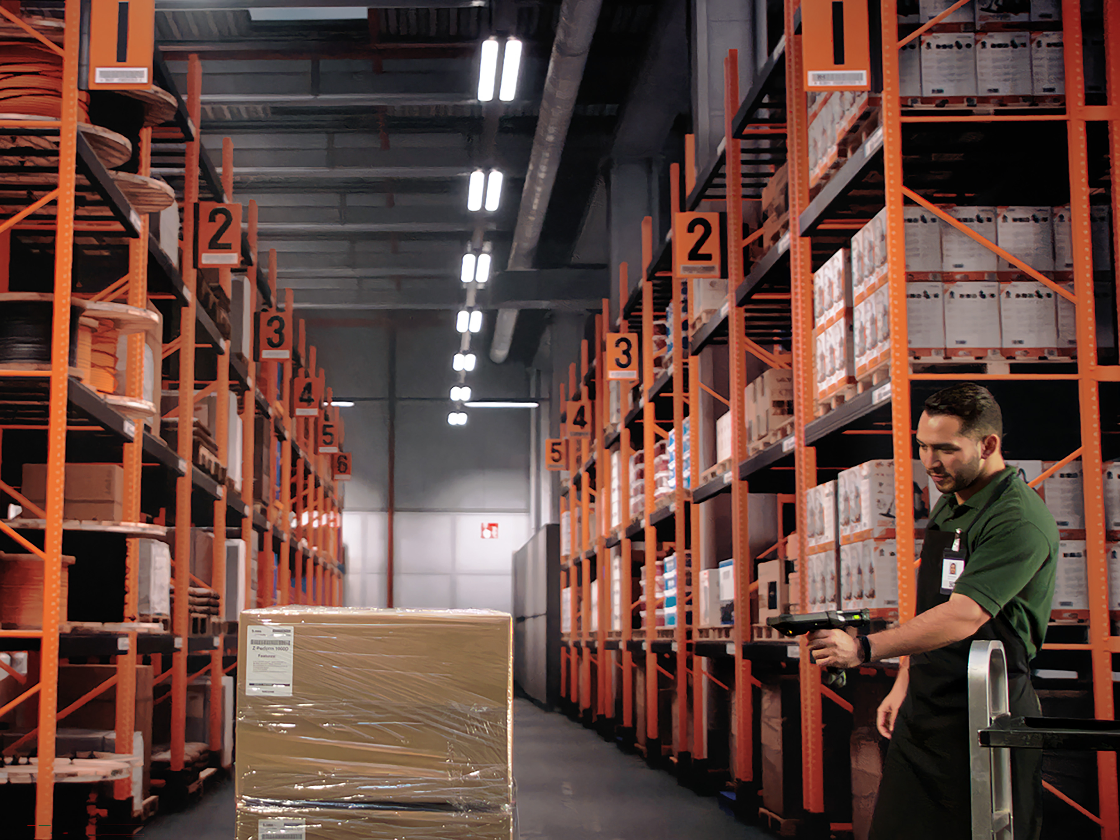
Curious Why, When, and How You Should Be Using AI in Your Warehouse or Other Supply Chain Operations?
More

Curious How Much Memory is Left on Your Zebra Android Devices? Want to Know Which Apps (or Devices) are Using the Most Cellular Data?
More

Trying to Reduce Waste and Enable More Efficient Operations in Your Warehouse? Start by Cleaning Up Your Receiving Area
More

Want Relief from the “Triple Squeeze” Choking Your Business? Technology May or May Not Help. It All Depends on Your Habits.
More
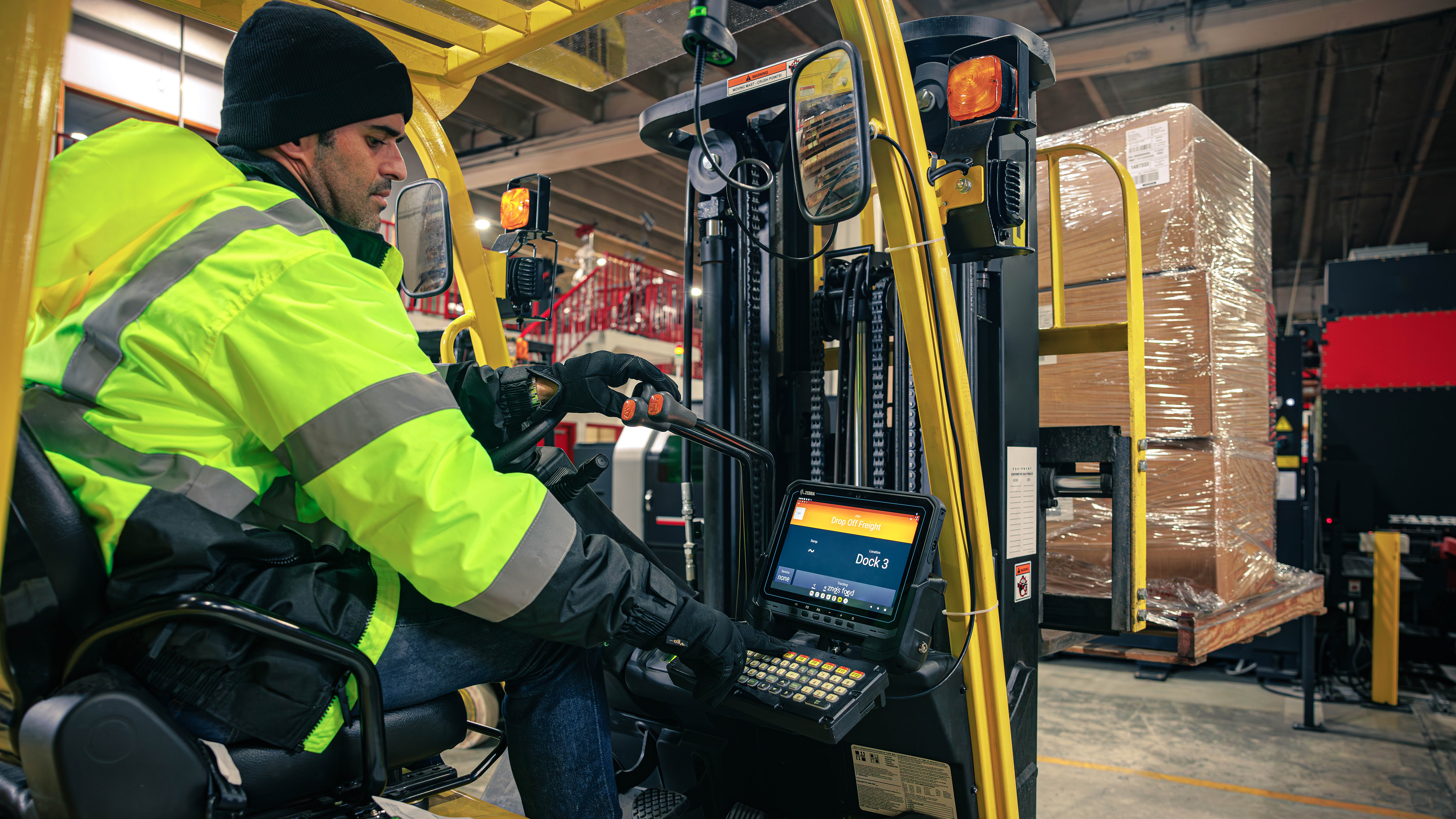
Should You Really Be Using That Mobile Computer or Tablet in Cold (or Freezing) Warehouse, Yard, and Field Environments?
More

Is It Time for You to Consider Using Wi-Fi-based Fine Timing Measurement (FTM) for Mobile Device Locating?
More
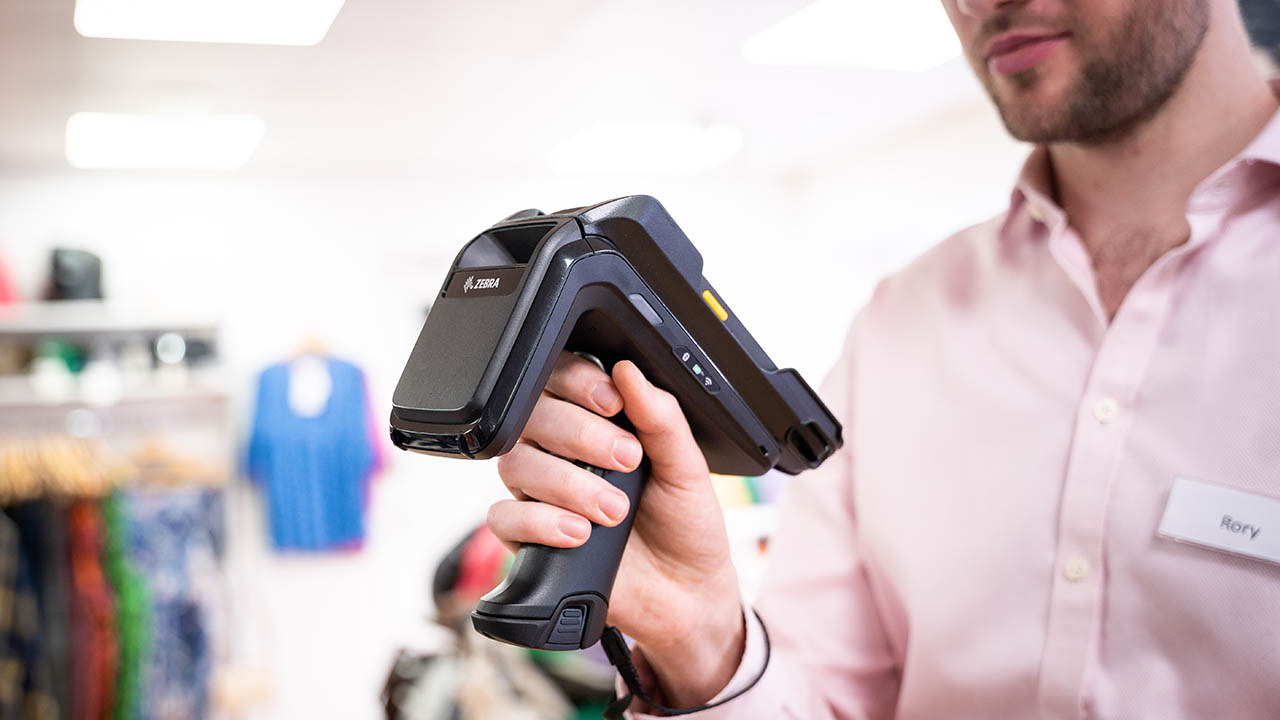
Researcher-Led Simulation with PacSun Reveals Why Inventory Planning, Store Operations, and E-commerce Fulfillment Problems Can’t Be Solved in Silos
More

Shining a Light on Everything: The Benefits (and Limitations) of Both Wireless and Location Technologies May Not Be What You Think
More

Celebrating the Impact of Our Culture on Customers and Communities
More

Zebra’s New Chief Revenue Officer Explains What’s Changing and What’s Not at the Company and in the Channel
More
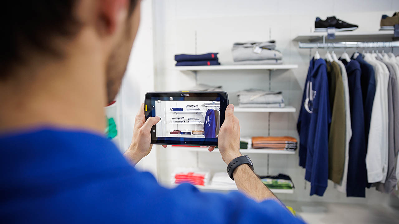
Is Generative AI Really Going to Change the Retail Experience as Some Experts Claim?
More
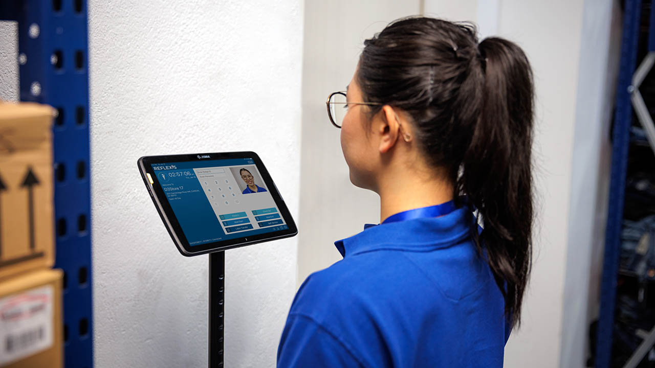
How to Assess Schedule Quality in Workforce Management Software (and Why You Should)
More

You Can Now Connect Your Zebra Mobile Computers with New Barcode Scanners and Point of Sale Devices in Just a Few Minutes (without Any Technical Know How)
More

Now Is Not the Time to Retreat from Self-Checkout (SCO)
More

Deep Learning Isn’t a “Bleeding Edge” Technology, but It Can Help Stop the Bleed at the Edge of Your Business. Here’s How.
More
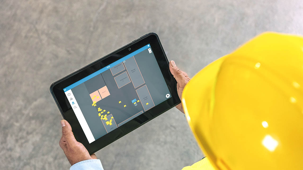
Is There Really a Difference Between Private 4G and Private 5G Wireless Network Performance? Or Private Wireless and Wi-Fi Network Performance?
More

It Wasn’t All in My Head, After All: What It Took to Finally Be Seen, Heard, Understood and Diagnosed
More

The Point of Sale is Where Sales are Won or Lost. So, What are You Doing to Win?
More

Why AI Isn’t Working for Everyone
More
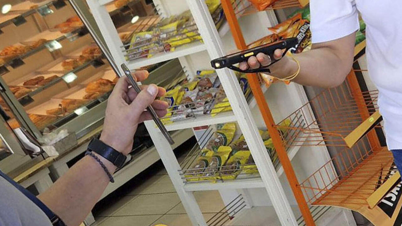
A Trip to Paradise Shouldn’t Be Delayed by Long Lines
More

There is More Than One Way to Track Trailers (and Inventory) on the Move. This Retailer Proved It.
More

Industrial Automation Insider: Manufacturing Millennial Says Automation (and People) are Severely Misunderstood, and That’s Hurting Your Production Capacity
More

Do You Really Need a “Voice-Only Picking Solution”? Or Would “Voice Technology” Better Enable Your Picking Process?
More

How You Should Be Using AI for Testing and Quality Assurance
More

Your Store Manager's Christmas Wishlist: More Time
More

The Case for On-Site, In-Person Software Implementation Projects
More
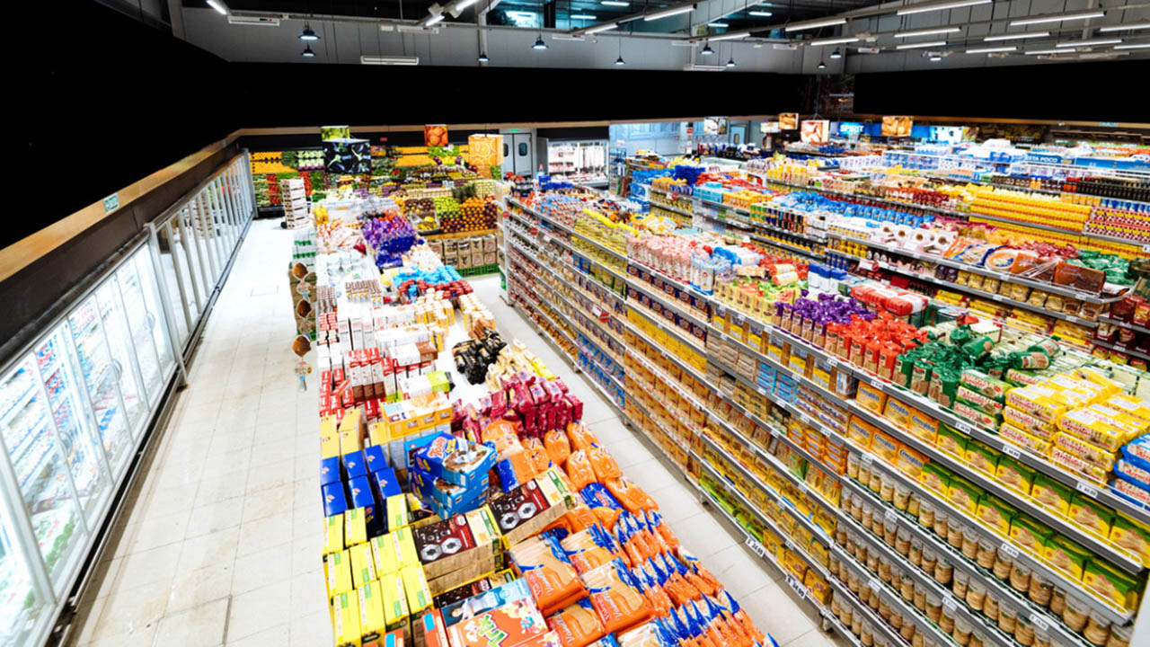
Getting the Numbers Right: AI Solutions for Grocery Demand Forecasting
More

Why You Should Be Talking More About Voice Technology with Warehouse Managers and Associates
More

Searching for Answers? Your Mobile Device Could Soon “Know It All” (or At Least Help Ensure You and Your Employees Do)
More

Industrial Automation Insider: How Machine Vision is Helping You Better See What’s Happening with Your Favorite Fast Food, Sports Teams and More
More
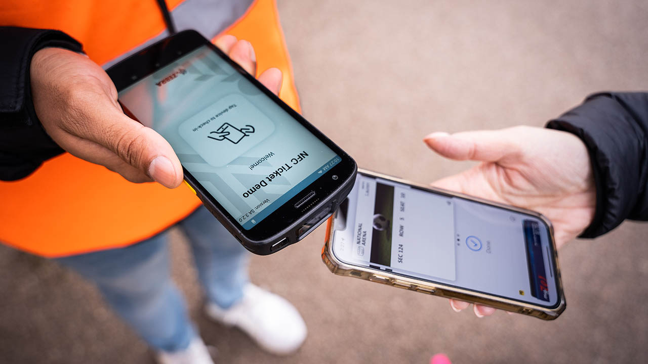
How to Speed Up Ticket Checks (and Boarding) on Passenger Rail Routes
More

How to Prepare for Your Move to Wi-Fi 6 – and Wi-Fi 6 Printers
More

How to Properly Integrate Automated Data Capture Hardware with Your ERP System
More

Zebra’s Chief Supply Chain Officer Says, “It’s Time to Get Back to Basics”
More

What is a Mobile Device Really Going to Cost You? (Probably Not What You Think)
More
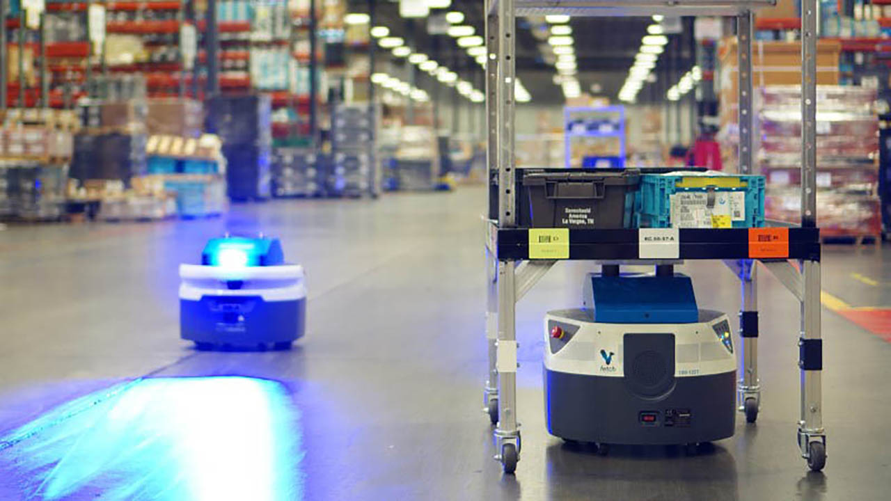
Shedding Light on the Dark Warehouse
More

You Might Not Be Charging Your Mobile Devices the Right Way, Which Means You Might Be Killing Your Battery
More
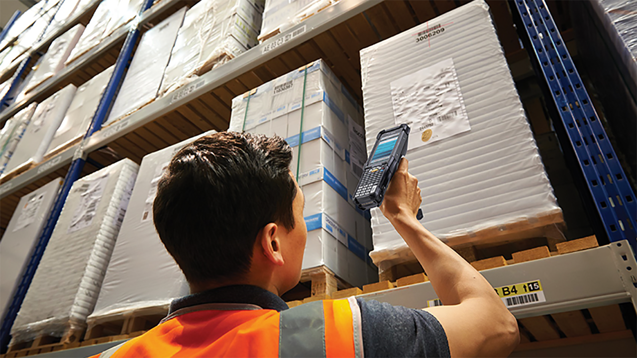
Hoping to Automatically Capture Data from Barcode Scanners, RFID Readers, and Mobile Computers and Feed It into Your ERP?
More

A Look at Labor: Are You Giving Too Much Credit to Technology?
More
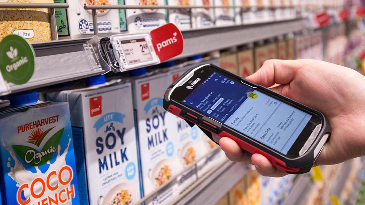
Technology Should Help Employees Get the Job Done, Not Stand in Their Way
More

"I Feel Bad."
More

Clini-Chat: How to Prevent Hospitalisation-Related Iatrogenic Dependence and Reduce Hospital Return Rates Among Older Patients
More

Ask the Expert: “What Questions Should I Be Asking Mobile Device Manufacturers About Security in My Solicitations?”
More

AI 101: Automating the Mundane
More
Home Improvement Projects Don’t Always Go as Planned, but a Good Craftsman Doesn’t Blame His Tools
More
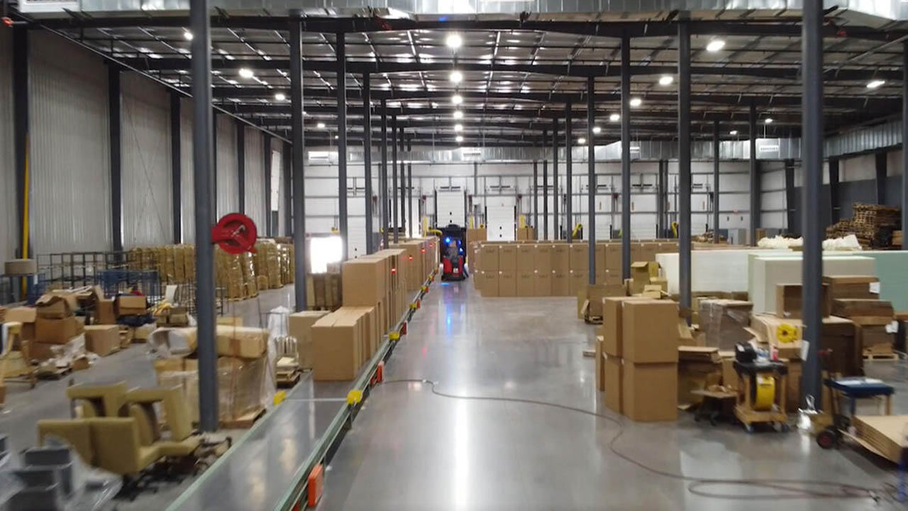
“This Has Been a Dream Come True”: Hunt Country Components CEO Howard Hellwinkel Finally Found a Way to Use RFID “Like the Big Companies” in His Upholstered Furniture Manufacturing Operation
More

Protecting Bank Branches from Regulatory Pitfalls: The Communication Compliance Challenge
More
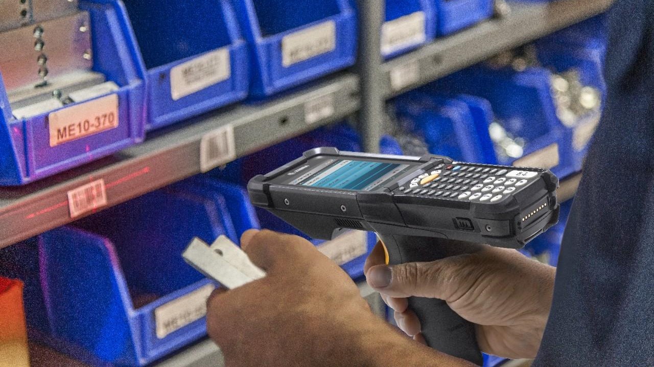
There’s a New Alternative to Legacy SAP Mobile Solutions That You May Want to Look Into
More

Do You Have the Right Amount of RAM?
More
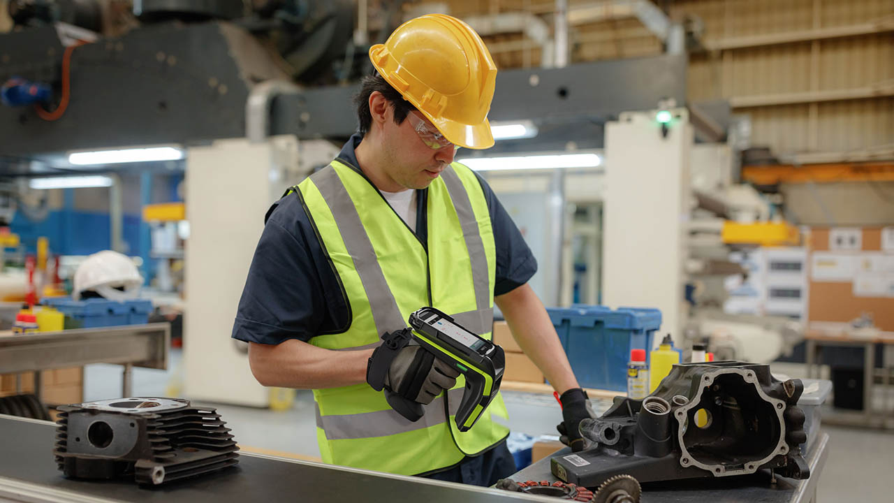
Industrial Automation Insider: Which is the Best Choice for Track and Trace, Quality Control, Loss Prevention and More: A Barcode, RFID or Vision System?
More
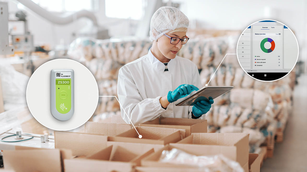
Is Your Business Ready to Comply with the European Union’s Digital Product Passport Legislation?
More

Let’s Talk About Mobile Device Security, Because Your Device May Not Be as Secure as You Want Out of the Box (Thanks to Your Device Manufacturer)
More

What Can Hospital Leaders Do to Accelerate Digitalisation and Meet New Efficiency Mandates?
More

Wondering How to Improve Warehouse Operations? Not Sure If Any Single “Solution” Will Work Like You Want? Put People First, Says One Supply Chain Executive, and Everything Will Be Okay.
More

What Your Workers Can and Can’t Scan with Different Types of Mobile Devices
More

Looking for a Way to Make Your Home Health Operations More Efficient? Here are Some Changes to Consider.
More
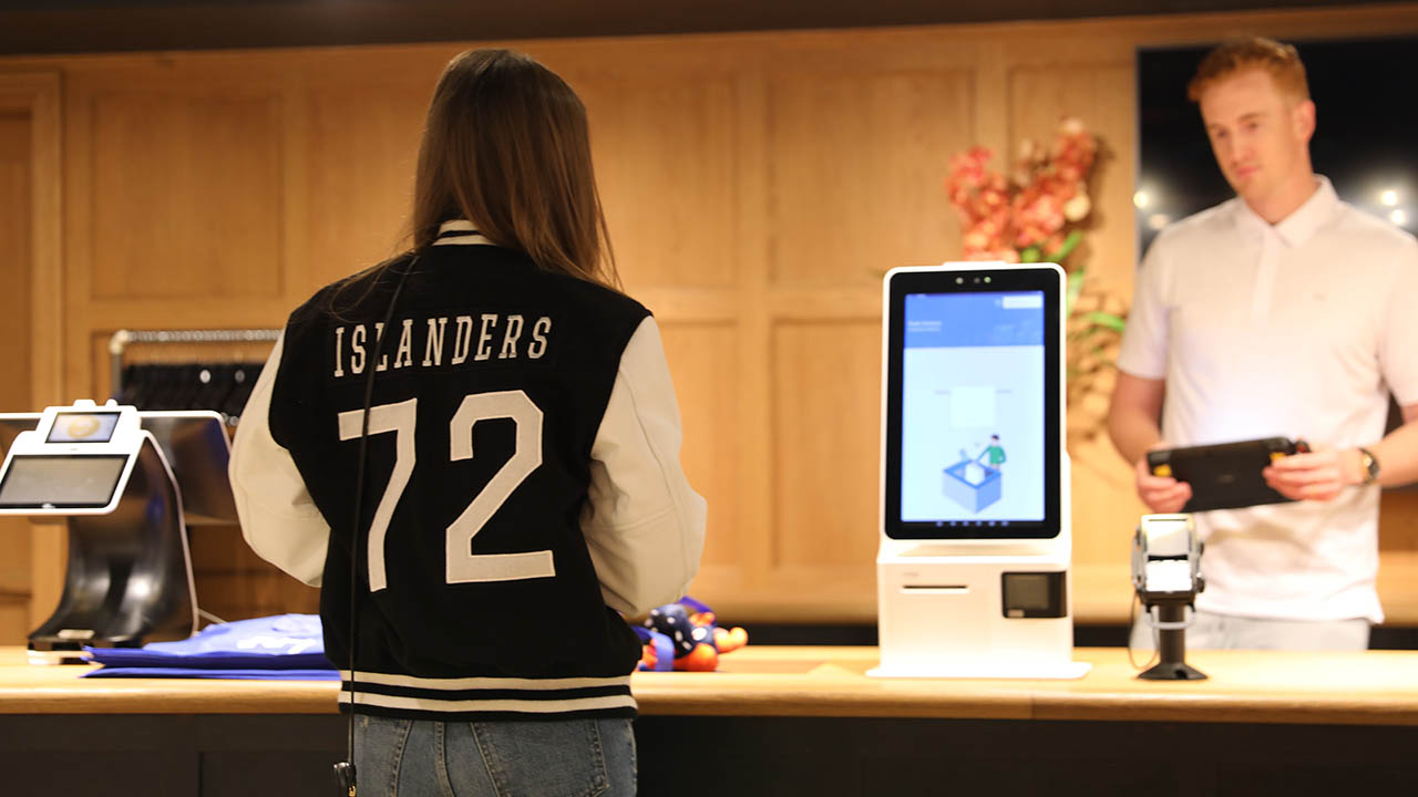
Chalk Talk Episode #14: This is What It Really Takes to Ensure You Have the Ultimate Fan Experience
More

Ask the AI Expert: “How Should I Be Leveraging Machine Learning Operations (ML Ops) to Put AI in Production?”
More

Wondering Why It’s Taking So Long to Get a New Software Application Online? Or Why It's Hard for Your Team to Define Minimum Viable Product (MVP)? Here's What I Know as an Insider.
More

Empowering the Frontline: Inside Grupo Bimbo’s AI-Powered Transformation in Its Bakeries and the Stores It Stocks
More

Hot Update! You Can Now Use Public Maps to Find Your Missing Zebra Mobile Devices.
More

Safety at the Touch of a Button: A Key to Retaining Staff in Hospitals, Clinics and Ambulatory Surgical Centers
More
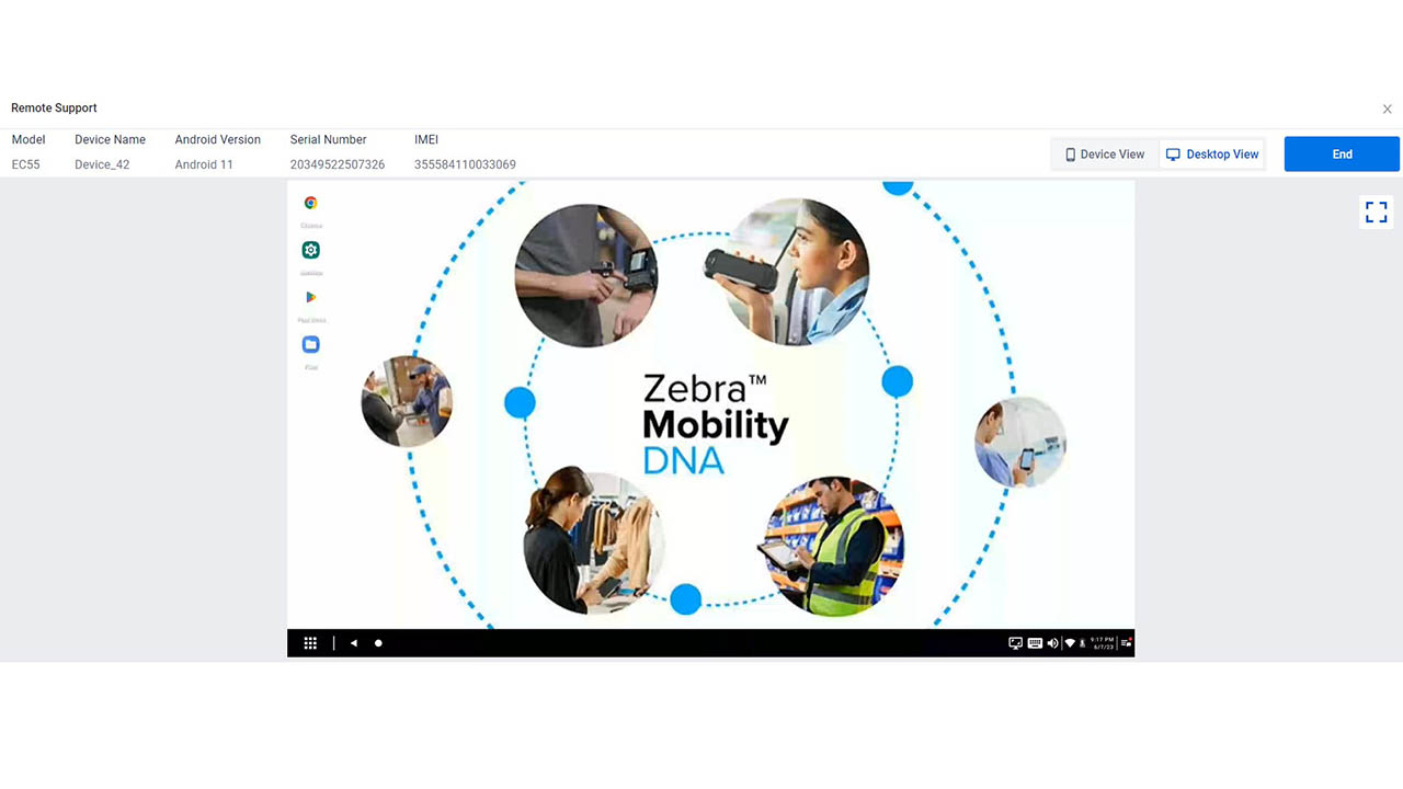
Four New Ways You Can Use Zebra DNA Cloud (Whether or Not You Have an EMM)
More

Five Ways You Can Use AI to Meet Your Banking Customers Where They Are (in Branches)
More

67 Minutes
More

Why You May Not Always Want Your Workers’ Android Mobile Devices to Automatically Connect to Wi-Fi
More
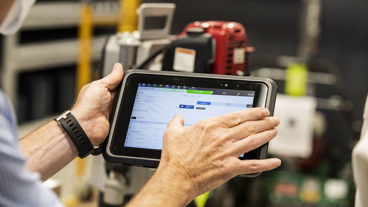
There are Three Things You Must Do as a Business Leader Right Now if You Want to Still Be a Business Leader in a Year (Especially If You’re in Retail, Hospitality, Banking or Warehousing)
More

People – Supported by the Best Technology – Are Driving Successful Business Outcomes
More

You Might Be Losing Money on Your Enterprise Software Investments for This One (Completely Avoidable) Reason
More
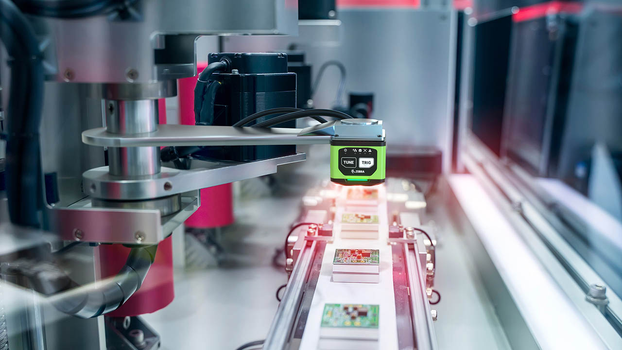
Industrial Automation Insider: One Expert Explains How Machine Vision Systems are Changing – and How They’ll Change Your Perception of Your Business
More

How to Check If Blood Samples Stayed Chilled Out in Transit
More

What Most Police Officers, Parking Enforcers, Border Agents and Other Public Safety Officials are Missing at Traffic Stops, Checkpoints and Incident Scenes
More

Embrace the Spirit of Juneteenth: How General Gordon Granger’s Audacity Has Reverberated Around the World
More

The Truth About AI: What Mainstream Media Coverage is Missing
More
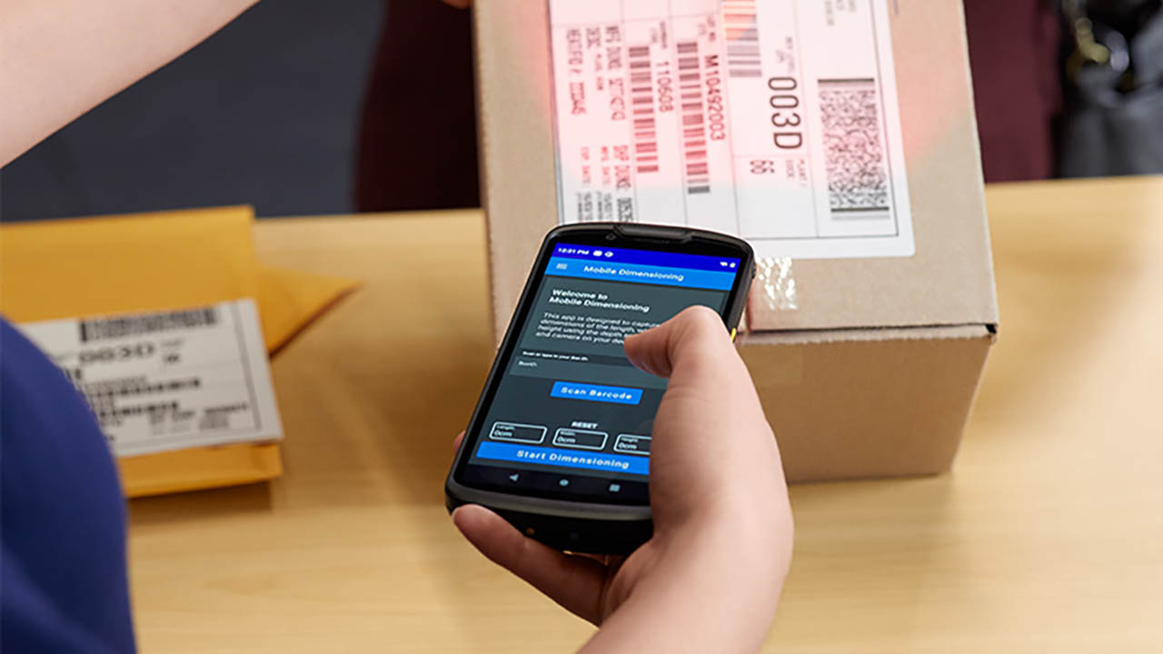
Everyone in the Shipping Chain Stands to Benefit from Mobile Dimensioning. Here’s Why.
More
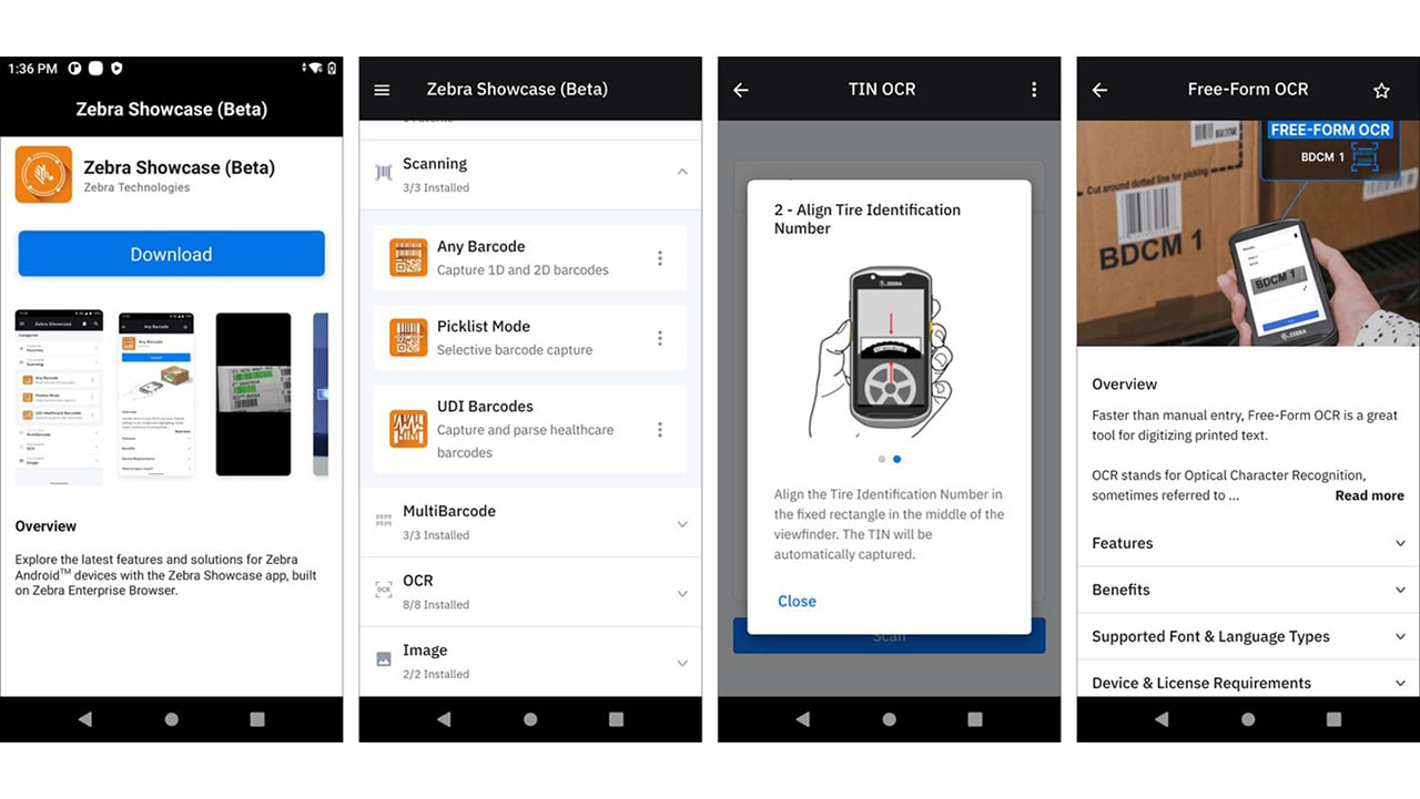
New Zebra Showcase App Now Live and Loaded with 16 Free Demos Designed for Everyone (Not Just Developers)
More

Seven Ways to Drive Size Optimization Precision
More

Why Show Your Pride?
More
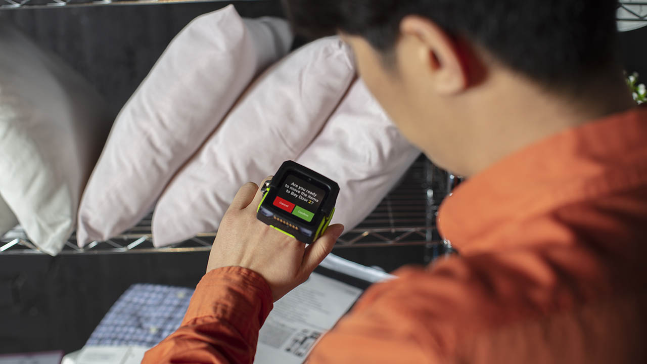
How Wearable Technology is Speeding Up Front-Line Worker Training in Warehouses, Distribution Centers, Retail Stores and More
More

“The Asian Experience” May Not Be What You Think
More
A Closer Look at Walgreens’ AI-Powered Demand Planning Transformation
More

The Long Road to Branch Operations Modernization: Are You on the Right Path?
More

Ask the Expert: Do the Benefits of a BYOD Workforce Mobility Strategy Outweigh the Risks?
More

Why It's Wrong to Think of RFID as a Barcode Replacement
More

The Best Replenishment System Might Be the One You Already Have
More

Happy 60th Birthday to the GUI: What’s Next for the Graphical User Interface?
More

Why the Best First Step in the “Retailization of Healthcare” is Implementing a More Efficient Scheduling Solution
More

Does Omnichannel Demand Planning Make Sense for Mid-Tier Fashion Retailers?
More

It’s Shocking How Well This RFID Pioneer Predicted the Future
More
![[Category, Subcat or Product] Representational Image 1800x450](/content/dam/zebra_dam/global/zcom-web-production/web-production-photography/press-releases/press-release-photography-website-crewpack-reduces-order-delivery-times-by-86-percent-with-zebra-technologies-16x9-800x450.jpg.imgo.jpg)
Crewpack CEO: “We Were Wasting So Much Time and Money Searching for Inventory in Our Warehouses.”
More

Back to Basics: How to Use a Barcode to Automate Data Capture, Positive Patient ID and More in Healthcare Settings
More

Chalk Talk Episode #13: This is What It Takes to Be a College Football or NFL Scout, According to Jim Nagy
More

What Makes for A Winning Early Career Professionals and Intern Program
More

This is the Real Problem Banks Face Right Now (According to Branch Banking Employees)
More
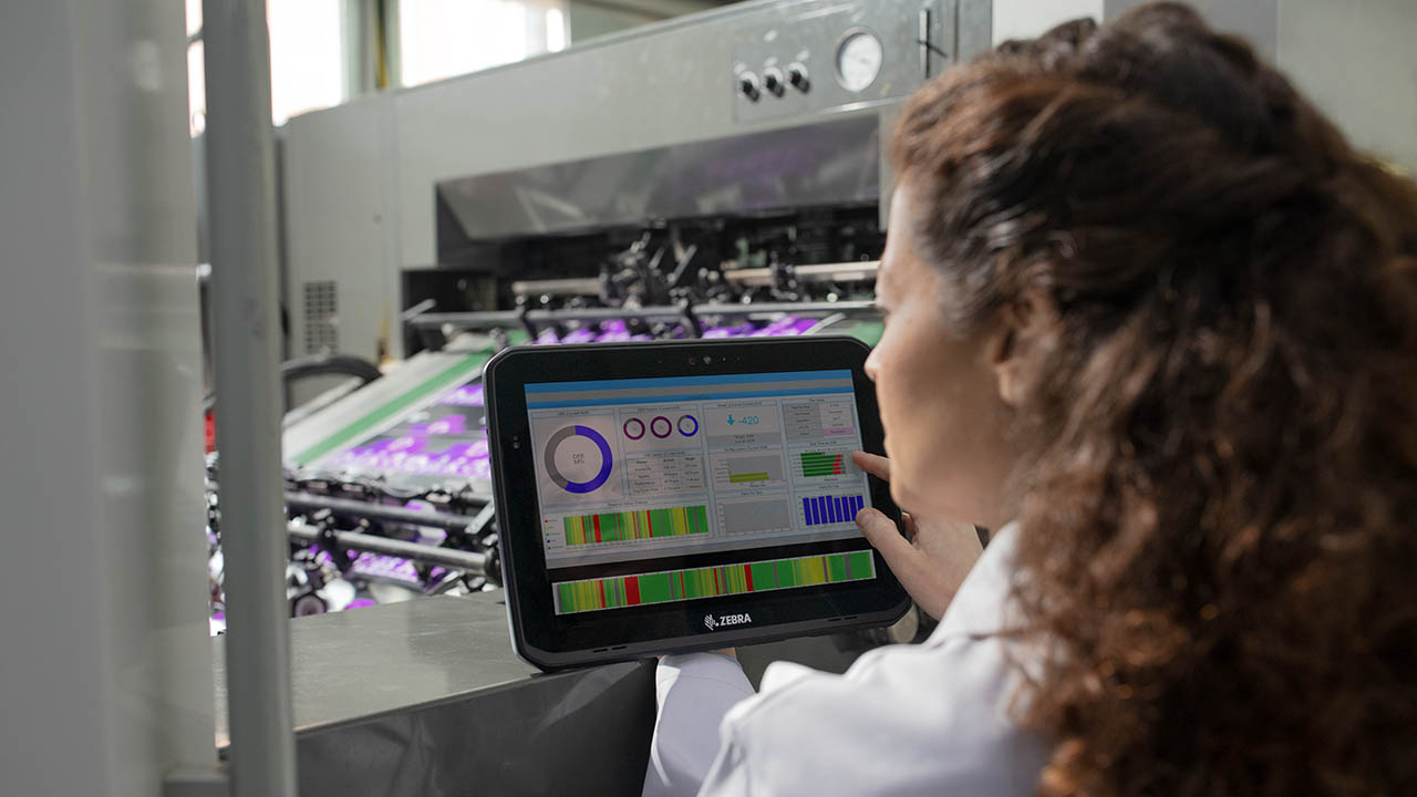
Still Not Sure if Private 5G is Better Than Wi-Fi? You Might Not Be Assessing the “Value” of Each Correctly
More

Front-line Workers Should Be Able to Grab Any Device and Get to Work in Any Role. This One Switch in Your Mobile Software Setup Will Help.
More
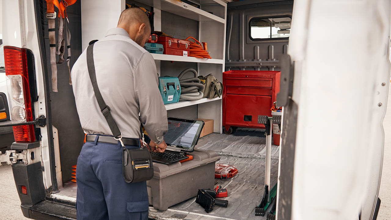
Data Isn’t Valuable Until You Do Something with It. That’s Why Data Sharing Partnerships Like This are So Important in Every Industry.
More

Chalk Talk Episode #12: Don’t Get into a Football Trivia Challenge with Cincinnati Bengals Defensive End Jeffrey Gunter. You Will Not Win.
More

How Do You Intend to Navigate 2023 (and Come Out the Other Side Better Positioned to Meet Shoppers’ Needs)?
More

Women in Sports: “Faith, Family and Food” Keep Tommi Vincent Grounded. They Also Help Her Uplift Many Others.
More

Four Lessons Branch Bank Leaders Can Learn from Retailers
More

Focus on Equity, Not Just Equality. It’s Good for Everyone.
More

3 Ways That You Can Transform Your Stores and Prepare for the Future of Retail without Ripping, Replacing or Disrupting Anything
More

How Your Quick Service Restaurant Can Respond to the Death of Single Use Plastics
More

Technology Can Drive Healthcare Compliance, Patient Care and Telehealth. So Why Does Everything Still Seem So Hard?
More
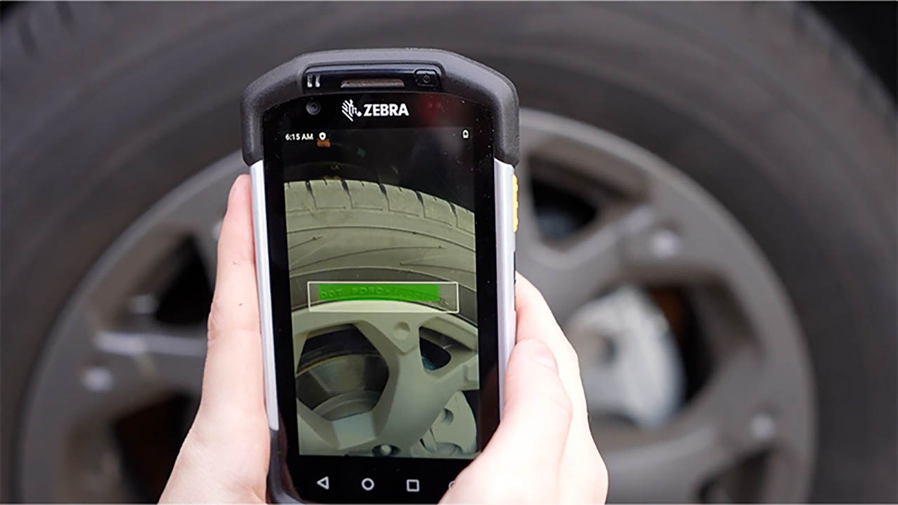
There’s an Easy Way to Automatically Capture VIN, TIN and License Plate Data in Automotive Supply Chains, Stores and Service Centers as Inventory Moves In and Out
More

Day One as CEO
More

As the Floricultural Sector in Colombia Flourishes, Logistical Changes are Needed to Keep Products – and Opportunities – from Wilting
More

Industrial Automation Insider: The Unexpected, but Highly Effective, Uses of High-Tech and Low-Tech Automation Solutions in Healthcare
More

Are Locked Up Items Slowing Down Your Retail Sales? Or Costing You Sales? This May Be a Better (and Less Expensive) Loss Prevention Strategy.
More

How to Use Your Bank Branch Scheduling Processes to Drive Revenue
More

What (Else) You Need to Know Before Deciding Whether a Consumer or Enterprise Mobile Device is Really the Best Choice for Your Employees – and the Success of Your Business
More

8 Things You Probably Didn’t Know About Mobile Dimensioning (But Should If You Accept or Process Packages)
More

Twenty-Three Years Later, Are We Really Still Debating the Value of Enterprise vs Consumer Devices?
More

Struggling to Manage CPG Supply Chain Variability? This is What You’re Probably Missing
More

Ask the Expert: Why Should I Use a Private Wireless Network versus a Wi-Fi Network for My Business?
More
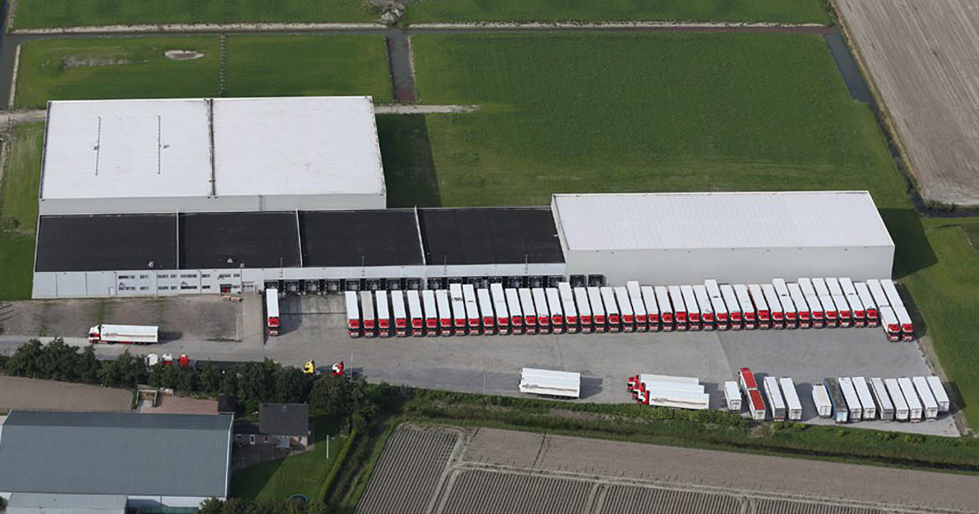
This Dutch Transport & Logistics Company Found a Better Way to Keep Your Sweet Tooth Satisfied
More
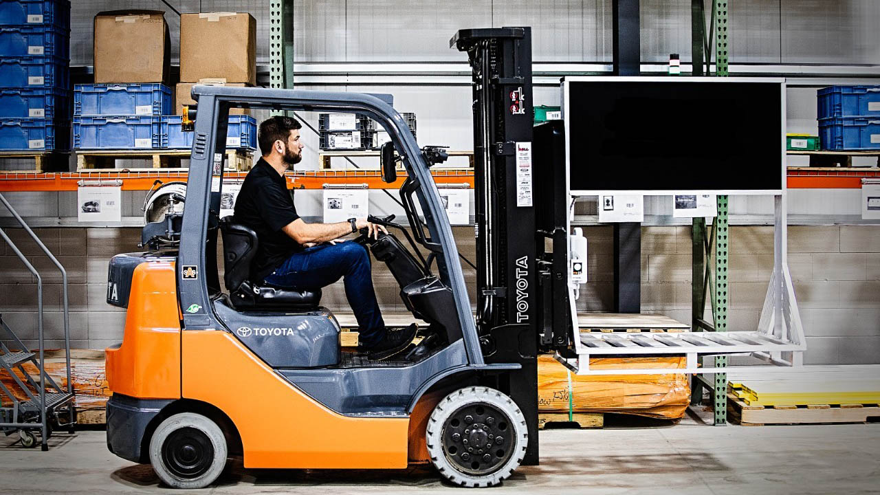
Warehouse and Distribution Center Operators are Reaching for the Sky with New RFID Technology
More

Think Your Organization’s Cybersecurity Practices are Protecting Your Customers’ Privacy? Why One Top Privacy Expert Says You’re Probably Wrong
More

Proactive Device Management Gives Italian Wholesaler a Performance Edge
More

How AI is Redefining Direct Store Delivery
More

Where Are Banks Falling Short on Branch Efficiency?
More

Good News! You Can Now Keep Track of All Your Zebra Barcode Scanners on One Screen, from Anywhere in the World
More

“This is Not Someone Else’s Struggle. It’s Our Struggle”
More

Today’s Shoppers Want and Need Everything to Happen Faster in Retail Stores. Making This One Change on the Floor and Even in the Back Office Can Help.
More

Industry’s First Freezer-Rated, Single Finger Bluetooth Wearable Scanner Hits the Market at Just the Right Time
More

Chalk Talk: Love the NFL’s Next Gen Stats? This is How They All Come Together Inside the Command Center
More

How to Forecast During Unprecedented Uncertainty
More

What I Have Learned About Leadership as CEO the Past 15 Years
More

2020
More
2023
More

2024
More
2025
More

Retailers: If You’re Leaving AI Out of Pricing Strategy Decisions, You’re Leaving Money on the Table
More
2026
More
Zebra Developer Blog
Zebra Developer BlogZebra Developer Blog
Are you a Zebra Developer? Find more technical discussions on our Developer Portal blog.
Zebra Story Hub
Zebra Story HubZebra Story Hub
Looking for more expert insights? Visit the Zebra Story Hub for more interviews, news, and industry trend analysis.
Search the Blog
Search the BlogSearch the Blog
Use the below link to search all of our blog posts.
The views and opinions expressed in Zebra's blog posts are those of the authors and do not necessarily reflect the official policy or position of Zebra Technologies. Have a question, comment, or idea for future blog discussions? Send them to blog@zebra.com.
Legal Terms of Use Privacy Policy Supply Chain Transparency
ZEBRA and the stylized Zebra head are trademarks of Zebra Technologies Corp., registered in many jurisdictions worldwide. All other trademarks are the property of their respective owners. Note: Some content or images on zebra.com may have been generated in whole or in part by AI. ©2026 Zebra Technologies Corp. and/or its affiliates.